Test

A record of every check you ran on the site, how you ran it and what it found, and a signed pre-send gate.

0 / 8 complete

Starts with
Review address, The brief, Direction, Claims list, Baseline
Produces
QA record, Signed gate
Feeds into
Improve

Production Checklist

  1. Video, 1:22 Introduction to Test Introduction
  2. Video, 3:58 Review the work against its brief Makes: Brief review
  3. Video, 2:34 Revise in rounds Makes: Revision log
  4. Video, 4:25 Test with keyboard and screen reader Makes: Accessibility record
  5. Video, 3:00 Test every width Makes: Width sweep
  6. Video, 3:42 Measure and fix speed Makes: Speed check
  7. Video, 2:18 Check security and privacy Makes: Security and privacy check
  8. Video, 4:14 Run the pre-send gate Makes: Pre-send gate
  9. Video, 2:22 Run a client review round Optional

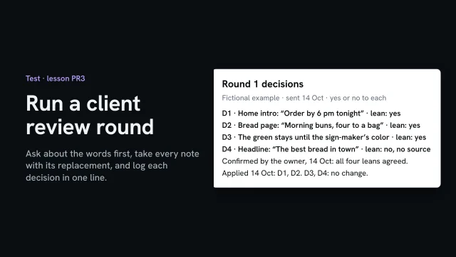
Run a client review round

Ask about the words first, take every note with its replacement, and log each decision in one line.

More

Full transcript

The bakery's review build is ready for the owner and the head baker. A round goes well when they know what you're asking, and every note says what to change it to. And every decision ends up in one line they've agreed to.

So the email asks one thing. Read every page as a customer would, and check the words: is each fact true, is anything missing? The look comes in a later round. Only they can check the facts, and a comment about color can bury a wrong price.

The review tool asks for the replacement first, not for what's wrong. On her phone, the owner clicks the line under the headline, and types what it should say. Order by six tonight, which is when orders close. The head baker pins the Morning buns. The price is for a bag of four, and this page doesn't say so. The order page does. Not every replacement is a yes. That evening the owner pins the headline too, and asks for the best bread in town. Best is a claim, and nothing backs it up. Some notes still come by email, with no replacement. The owner writes that the green looks too dark. Pin it yourself, in the same queue, so no note lives in two places. The queue runs in page order, so you fix each page once.

Turn each note into one numbered line: what changes, and your lean. Two are easy yeses. For the green, you suggest waiting: it's provisional until the sign-maker's color arrives. For the headline, your lean is no, and the reason goes in the same line. She can still overrule you, but now she's deciding on a reason. Send the lines, and ask for a yes or no on each. Her reply takes seconds: she agrees with all four. Now every change, and every no, has a decision you can point to.

Then make one round of fixes, only the confirmed lines. On the home page, the line now says order by six. Count the round: four notes received, two applied, two decided with no change, none open. Then tell them exactly that, so they check two lines instead of the whole site. Notes that come in now wait for round two, which is about the look.

Ask about the words first. Take every note with what to change it to, and keep each decision to one line the client has agreed.

Introduction to Test

Starts with
Review address, The brief, Direction, Claims list, Baseline
Produces
QA record, Signed gate
Feeds into
Improve

Review the work against its brief

Re-read the brief, then go page by page and write down every place the site fails it, quoting the line it breaks. Rank what you find by how much it gets in the way of the site’s one job.

Also in this task

Get an honest AI review 4 min

The lesson’s own page, with its transcript

What you’ll make

Before you start
The review build and the brief.
You’ll learn
Judging the build against the brief, positioning and recipe, critique before praise, ranked by harm, then remove one thing.
You’ll make
A review against the brief, ranked.
Worked example
The bakery’s review against its brief: fictional findings. The founding year is still an open question for the owner.
Used next
Fixes, then the keyboard, width and speed checks.

Review against the brief

Independent AI review

Where 1
Where 2
Where 3

Copy or download your answers before you leave this page.

Write your own findings and date them before you ask anyone else, so a second review can’t shape them. Then give a fresh reviewer the brief and the site, but not your findings or the build history.

Done when every finding names where it is, quotes the line of the brief it breaks and says what changes, and the list is ranked by harm to the one job.

More

Common quality-check mistakes

Each of these feels like checking. The struck line is how it sounds on a real project.

  1. Looks like: Is this page any good?

    Letting the builder grade its own work

    Review in a fresh session that never saw the build conversation, and write your own critique first, so there are two reads to compare.

    Skill Get an honest AI review

  2. Looks like: Accessible, or compliant

    Calling your own check more than it was

    Record it as a human check by you, with the screen reader, browser and versions you used. User testing means people from the site’s audience using it; for accessibility, that means disabled people.

    Skill Test a page with keyboard and screen reader

  3. Looks like: Darken one caption by hand

    Patching the instance

    Ask what made it: a token, a component or the content. Fix that once, then re-test everywhere it reaches.

    Skill Fix accessibility at the source

  4. Looks like: Run the test, then explain the score

    Measuring without a guess

    Write down what you expect to be slow before you run anything. The gap between your guess and the result is the lesson.

    Skill Predict, measure and fix performance

  5. Looks like: 1280, 768, 375

    Three widths, and a sign-off

    Drag through every width from your widest down to 320, with the longest real content, and fix the rule that breaks, not the width.

    Skill Test responsive behavior across every width

  6. Looks like: robots.txt will keep it out

    Believing instead of checking

    Fetch what the live address actually sends: the header, and the tag in its source. Then sign it with the version you checked.

    Skill Run a pre-send gate

  7. Looks like: Can we make it pop?

    Taste dressed up as a finding

    Name the element, quote the line it breaks, say what changes and why. If it can’t cite the brief, it’s taste.

    Skill Review the work against its brief

The continuing example: AllWeb

AllWeb’s standard is its own brief and the manuscript’s list of what the site must do: review the redesign against those lines, not against taste. Its independent critic was a separate AI chat (ChatGPT), and an outside audit tool, SlapMyWeb, scored the redesign 85/100 on 7 October 2026.

After the fixes, test again: The live review loop re-sweeps the whole build against a frozen baseline, so a fix can’t quietly break something else.

Example project files
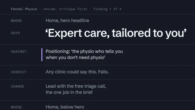
One finding, cited
1WHERE Home, on a phone, first screen
2SAYS Photo full width; Order ahead below it;
3 header folds the order link behind Menu
4AGAINST Brief, sign-off check: 'Is ordering
5 ahead on the first screen?'
6VERDICT Fails. Highest harm: it's the one job.
7CHANGE Keep Order ahead in the phone header,
8 every page. Photo-first rule stands.
9RECHECK 16 October, on a phone: passes
Reviewer prompt
1Review the site at the review URL below.
2Judge it only against these files:
3 brief.md, positioning.md, art-direction.md,
4 claims.md
5For each failure: where it is, the line it
6breaks, and what would fix it.
7Only report what affects the brief or the truth.
8No praise. No style preferences.
Reconciliation note
1AI 'Caption contrast too low' correct: token
2AI 'Add customer testimonials' no: none cleared
3AI 'Too much empty space' taste: no line broken
4AI 'Menu hard to find' right feeling;
5 cause: label drifted
6ME 'Order ahead hidden, phone' AI missed it

The cited finding is a fictional physio clinic’s; the reconciliation note is the bakery’s. The prompt names the project’s documents as files, the way one AI coding tool reads them.

From the skills Review the work against its brief, Get an honest AI review · fictional client

Where yours go: Organize your project, in Prepare.

Full transcript

Someone sends you a build and asks what you think. The weakest answer you can give is that it looks good. Plenty of sites look good, and saying so tells nobody what to change.

A review answers one question: does this build do the job it was given? You already wrote the job down. The brief says what the site must achieve, states its one job in a line, and ends with the checks it has to pass before sign-off. The positioning says what only this business can claim. The art-direction brief, with its recipe, says how it should look and why. Those documents are the standard. Your taste isn't.

Comments like these are feelings about the whole page. None of them can be acted on, and none of them can be argued with, which is the problem. A judgment names one element, quotes the line in the brief, positioning or recipe that it breaks, and says what should change. If you can't find a line to quote, you have two honest options. Find the gap in the brief and fix the brief, or drop the comment.

Do it in this order. Re-read the brief, the positioning and the recipe before you open the build, so you're holding the standard and not a first impression. Go through every page and write down each failure with the line it breaks. Rank them by how much each one gets in the way of the site's one job. Only then write what works. Critique goes first because praise anchors you. Once you've written that the hero is lovely, you start defending it. Don't skip the praise, though. What works, and why it works, is what nobody is allowed to break in the next round.

Here's the finding that matters most in the fictional bakery's review build, on October fourteenth. The brief's first sign-off check asks: is ordering ahead on the first screen? On a phone, it isn't. Here the phone's screen is three seventy-five by six sixty-seven pixels. The photo runs full width, the one Order ahead button starts at seven-thirty, below the screen, and the header folds the order link behind Menu. That breaks the site's one job, so it ranks first. The change keeps Order ahead visible in the phone header on every page, and leaves the photo-first rule from the art direction alone, because that rule is defended. On the sixteenth, the same check runs again on a phone, and it passes.

Then ask each page these questions. Start with the brief's sign-off checks, run exactly as written, on the device they name. Does the page serve the one job? Does it say something only this business could say? Is the decisive move from the art direction still there, and is the recipe followed on the inner pages, where builds usually drift? And can every claim on the page be traced to a source? A review that skips that last question can pass a site that's lying. The review is done when every sign-off check has been run.

Once the failures are listed, ask what would make this remarkable. A remarkable move has to trace back to evidence, like a confirmed claim or a customer's own words, or to intent declared in the brief. The bakery's customers keep writing “worth the queue”, and the positioning is already built on those words. What remarkable never justifies is a claim nobody confirmed, like the founding year the AI invented, lower contrast for the mood, or a skipped check because the client is waiting.

Last step, on every review: remove one thing. Builds collect elements because sites usually have them: a stats strip, a second call to action, a row of icons. Find the element that no line in any of the three documents defends, and cut it. If everything on the page is defended, say so and leave it alone.

If a judgment can't point to a line in the brief, the positioning or the recipe, it's taste. Find the line, or keep it to yourself.

If you own, make or teach this site
If you own or pay for the site
You decide when the site is ready to go out. Ask for the record, not a score: what was checked, by whom, on which version, and what nobody checked.
If you make it
You run the tools, then use the page yourself with a keyboard, a screen reader and every width. Each finding says where it is and what it breaks, and gets fixed where it started.
If you teach it or run a program
Have learners write their own critique before they read an AI’s, then sort its findings. Assess the record: does each line say how it was checked, and does a pass claim no more than it covered?
Getting a second review

Get an honest AI review: why the review has to come from something that didn’t build the site. The lesson saves the critique in version control; any dated note does the same job.

Give it: the brief and positioning; art direction and recipe; the review link or screenshots; the claims list. Withhold: your own critique; the build conversation; what you hope it says; who made it.

Sort every finding

  • Correct: fix it at the source
  • Right feeling, wrong cause
  • Not actually a problem
  • Taste, presented as a failure
  • What the reviewer missed
Checks that need judgment

Revise in rounds

Review on the live page, one note per change, each pinned to the element it’s about, and freeze the build as you reviewed it before anything is fixed. After every round of fixes, re-check the whole site against that frozen version and close a note only when the re-check passes.

What you’ll make

Before you start
The review build and your ranked review against the brief.
You’ll learn
  • One note per change, pinned to the element it’s about
  • Freezing the build as reviewed, before anything is fixed
  • Re-checking the whole site after every round, not only what the notes named
You’ll make
A revision log: every note, where it’s pinned, the round that fixed it and the re-check that closed it.
Worked example
The bakery’s first round fixed all three notes and put a second Order ahead button on two pages; the re-check caught it, and round two removed it.
Used next
The keyboard, width and speed checks run on the revised build, then the pre-send gate.

Revision log

Before anything is fixed

After the last round

Note 1
Note 2
Note 3

Copy or download your answers before you leave this page.

Two changes in one note become two notes, so each can be fixed, checked and closed on its own.

Done when every note is closed with the date of a full re-check that passed, and nothing that passed before the round fails after it.

More

Example project files
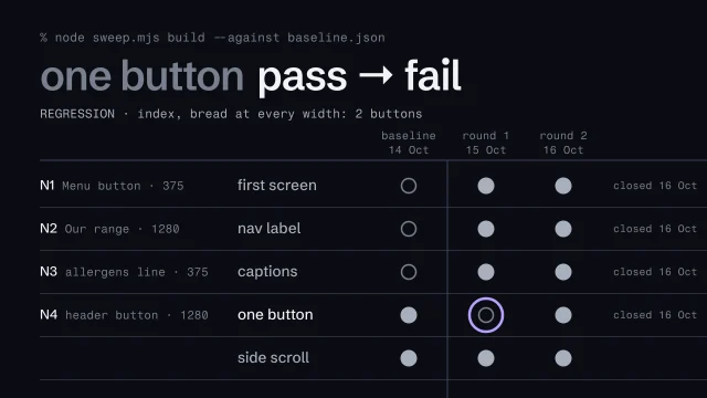
Round 1, re-checked against the frozen version
1% node sweep.mjs build --against baseline.json
23 pages × 4 widths, against the baseline
3first screen fail → pass
4nav label fail → pass
5captions fail → pass
6one button pass → fail REGRESSION
7 index, bread at every width: 2 buttons
8side scroll pass → pass

From a command-line re-check on the bakery’s review build. Any tool that re-runs the same checks on every page and width does the same job.

From the skill The live review loop · fictional client

Where yours go: Organize your project, in Prepare.

Full transcript

Review notes in a separate document drift away from the page. A note that says fix the header and the colors leaves the builder guessing which header, at which width, and when it’s done.

So review on the live page, in a loop. Pin each note to the element it’s about, and ask for one change per note. Freeze the baseline before anything is fixed. Then, after every round of fixes, sweep the whole build again, and close a note only when that sweep passes.

Here’s the bakery’s review build on a phone, three seventy-five wide. Select the element itself: the Menu button that hides the order link. The note pins to it and records the page, the element and the width, so the builder sees exactly what you saw.

My first draft of that note also asked for the label to read Today’s bread. That’s two changes, so it becomes two notes, the second pinned to the label itself. Each one can now be fixed, checked and closed on its own. The third note goes on an allergens line, a gray that measures three point one to one on the cream background. Three notes, three pins.

Before anyone fixes anything, freeze the baseline. Check that nothing is waiting to be saved, then tag the build as it was reviewed. Then run the sweep on it: every check from the review, on every page, at four widths. Three checks fail, one for each note. Two pass, and they have to keep passing.

The builder sends round one, and at three seventy-five all three notes look fixed. Don’t stop at the notes. Sweep the whole build again, against the baseline. Three checks went from fail to pass. One went the other way: the home page and Today’s bread now have two Order ahead buttons, at every width. The note asked for the order link in the phone header. The fix put a second big button in the header at every width, and the design allows one a page. Nobody checked the desktop, because no note was about the desktop. That’s what the sweep is for.

So the regression becomes a fourth note, pinned to that button. Round two stops folding the header links behind Menu on phones, so Order ahead is a link again and the extra button is gone. Sweep again: every check passes, and nothing that passed before has failed. Only now do the four notes close, each with the date of the sweep that proved it.

One note per change, pinned to its element. Freeze a baseline, re-sweep every round.

The loop, in five steps
  1. Pin each note to its element
  2. One note, one change
  3. Freeze the baseline
  4. After each round, sweep it all
  5. Close a note on a passing sweep

Test with keyboard and screen reader

Use every page type with only the keyboard, then listen to it with a screen reader, then zoom to 200%. Write each check down as your own, with what you used, and fix each problem where it started.

Also in this task

Fix accessibility at the source 5 min

The lesson’s own page, with its transcript

What you’ll make

Before you start
The review build.
You’ll learn
Keyboard, screen reader and zoom passes on every template, recorded honestly as a creator check.
You’ll make
Accessibility lines in the QA record.
Worked example
The bakery’s accessibility record: fictional findings, recorded as a human check by the person who built the site.
Used next
The pre-send gate.

QA record: accessibility

After the fix

Check 1
Check 2
Check 3

Copy or download your answers before you leave this page.

Method is automated (a tool ran it), human (you used the page) or declared (someone says so without a check). Record your own pass as a human check, never as testing with disabled people.

Done when every page type has a keyboard, screen reader and zoom line in the QA record, each saying how it was checked, with what, on which version, and every failure is re-tested after its fix.

More

Every check, with your site’s address filled in

A passing automated test is evidence, not approval.

These links open each tool on its own site with your address filled in. Aesthetary doesn't run the checks or see the results. Then open a kind of check below.

Automated checks (8)

What a machine can detect reliably. Run them first, read them as evidence, and never stop at the score.

Online tools need a public address: a noindexed or password-protected review build won't work in them. Test those with a coding agent and Chrome DevTools, or with Lighthouse on your own machine.

Human checks (7)

Things that need a person to use the page, not scan it.

Aesthetary judgment (6)

What no tool can decide. This is where the work is either right or merely passing.

Online tools need a public address: a noindexed or password-protected review build won't work in them. Test those with a coding agent and Chrome DevTools, or with Lighthouse on your own machine.

The continuing example: AllWeb

AllWeb’s page has a skip link and labeled header, navigation, main and footer landmarks. This is how you check they work.

Worked example: ten findings on a bakery’s pages, ranked and fixed

Ten findings. A tool made one of them. Six took a person using the page, and three were judgments about what the reviewer said.

The order page

  1. Order page · the order button

    Tab to it and nothing shows where you are.

    WCAG 2.4.7Who can find it: a person with a keyboard

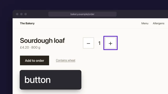
  2. Order page · quantity buttons

    A screen reader announces each one as just “button”.

    WCAG 4.1.2Who can find it: a person with a screen reader

The menu page

  1. Menu page · the menu link

    The AI reviewer: “Menu hard to find.” Right feeling, wrong cause: the link is there, but it says Bread, and people look for Menu.

    Who can find it: judgment

  2. Menu page · under the heading

    The AI reviewer: “Too much empty space.” That’s taste, and the brief asks for calm.

    Who can find it: judgment

  3. Menu page · card captions

    Gray on white, about 3.4:1. Text this size needs 4.5:1. The AI reviewer flagged it too.

    WCAG 1.4.3Who can find it: a tool

  4. Menu page · card links

    Six links that all say “Read more”. In a screen reader’s list of links they’re identical.

    Who can find it: a person with a screen reader

  5. Menu page · card descriptions

    At 200% zoom with text spacing on, the last line of every description disappears: the cards have a fixed height.

    WCAG 1.4.12Who can find it: a person zoomed in

  6. Menu page · cookie banner

    Tab to the Allergens link and the banner covers it completely.

    WCAG 2.4.11Who can find it: a person with a keyboard

  7. Menu page · after the bread

    The AI reviewer: “Add customer testimonials.” No. None are verified.

    Who can find it: judgment

On a phone, and at 200%

A phone
One card at 200%, text spacing on (pin 7)
  1. Phone · the header

    The order link is folded away behind Menu. The AI reviewer missed this one.

    Who can find it: a person on a phone

How they were written down

qa/record.md · accessibility lines
1A11Y-02 human fail 4 page types, Safari, keyboard
2 home Order button: no visible focus 2.4.7
3 menu cookie banner hides Allergens link 2.4.11
4A11Y-03 human fail VoiceOver + Safari, 4 page types
5 order quantity buttons read as 'button' 4.1.2
6 home hero alt is the file name 1.1.1
7A11Y-07 human fail 200% zoom + text spacing
8 menu card descriptions cut off 1.4.12
9basis creator_declared · commit 4e1c9a2
set up before you test
1Mac System Settings > Keyboard > Keyboard navigation
2 Safari > Settings > Advanced >
3 Press Tab to highlight each item on a webpage
4 VoiceOver on or off: Command-F5
5 VO key: Control-Option, or Caps Lock
6Win NVDA (free): start Ctrl+Alt+N, quit NVDA+Q
7 NVDA key: Insert, by default
8Note browser, screen reader and both versions

Illustration of a fictional bakery’s website, not a real site. The findings, the record and the setup are quoted from Get an honest AI review, Test a page with keyboard and screen reader, Fix accessibility at the source; where each one sits on these pages is our illustration.

Ranked by harm, sorted, and fixed where each started

The bakery’s site has one job: taking orders for the next morning. So each finding is ranked by how badly it gets in the way of someone ordering. Each one is sorted before anything is fixed, and each fix goes where the problem started, so it’s fixed once for every page.

Sorted by harm, fixed at the source

The ten findings ranked by harm to ordering ahead, with how each was sorted and where it was fixed
RankFindingSorted asFixed inThe fix
1Pin 10: The order link, buried on a phoneWhat the reviewer missedComponent: the header“Order ahead” stays in the phone header, beside Menu.
2Pin 2: Quantity buttons read as “button”CorrectComponent: the stepperEach button says what it does, like “Remove one Country loaf”.
3Pin 1: No focus on the order buttonCorrectComponent: the buttonThe focus style lives in the button component, so no button ships without it.
4Pin 8: The banner hides the Allergens linkCorrectComponent: the bannerThe banner takes its own space at the foot of the page instead of covering it.
5Pin 7: Descriptions cut off at 200%CorrectComponent: the cardThe card grows with its text. No fixed height.
6Pin 5: Captions at 3.4:1CorrectToken: the caption color#8C8C8C becomes #6B6B6B, about 5.3:1, and every caption, footnote and date moves with it.
7Pin 6: Six “Read more” linksCorrectComponent: the cardThe card’s own title is the link.
8Pin 3: “Menu hard to find”Right feeling, wrong causeContent: the labelThe link says Menu.
Not rankedPin 9: “Add customer testimonials”Not actually a problemNot fixedNothing, until there are real reviews the bakery has permission to use.
Not rankedPin 4: “Too much empty space”TasteNot fixedNothing. The brief asked for calm.

Fixed, and looked at again

The link says Menu, each card’s title is its link, the cards grow with their text at 200%, and the banner no longer covers the Allergens link.
  • The order link stays in the phone header.

  • “Remove one Country loaf, button”

    “Add one Country loaf, button”

    Each quantity button says what it does.

  • Focus shows on the order button.

  • #8C8C8Cabout 3.4:1#6B6B6Babout 5.3:1

    One token changed, and every caption with it.

What the reviewer was given, how it was sorted, and the token

reviewer prompt
1Review the site at the review URL below.
2Judge it only against these files:
3 brief.md, positioning.md, art-direction.md,
4 claims.md
5For each failure: where it is, the line it
6breaks, and what would fix it.
7Only report what affects the brief or the truth.
8No praise. No style preferences.
reconciliation note
1AI 'Caption contrast too low' correct: token
2AI 'Add customer testimonials' no: none cleared
3AI 'Too much empty space' taste: no line broken
4AI 'Menu hard to find' right feeling;
5 cause: label drifted
6ME 'Order ahead hidden, phone' AI missed it
tokens.css
1/* found: bread list captions, too faint */
2--caption: #8C8C8C; /* not on Design's list, about 3.1:1 */
3
4/* fixed once, at the token */
5--caption: var(--text); /* on the list, about 14.6:1 */

Illustration of a fictional bakery’s website. The sorting words, the prompt, the note and the caption colors are quoted from Get an honest AI review, Fix accessibility at the source. The ranking, the button names and the fixes for pins 2, 7, 8 and 10 are our illustration.

Example project files
QA record, accessibility lines
1A11Y-02 human fail 4 page types, Safari, keyboard
2 home Order button: no visible focus 2.4.7
3 menu cookie banner hides Allergens link 2.4.11
4A11Y-03 human fail VoiceOver + Safari, 4 page types
5 order quantity buttons read as 'button' 4.1.2
6 home hero alt is the file name 1.1.1
7A11Y-07 human fail 200% zoom + text spacing
8 menu card descriptions cut off 1.4.12
9basis creator_declared · version 4e1c9a2
Set up before you test
1Mac System Settings > Keyboard > Keyboard navigation
2 Safari > Settings > Advanced >
3 Press Tab to highlight each item on a webpage
4 VoiceOver on or off: Command-F5
5 VO key: Control-Option, or Caps Lock
6Win NVDA (free): start Ctrl+Alt+N, quit NVDA+Q
7 NVDA key: Insert, by default
8Note browser, screen reader and both versions
A color fixed once, in the design tokens (CSS)
1/* found: bread list captions, too faint */
2--caption: #8C8C8C; /* not on Design's list, about 3.1:1 */
3
4/* fixed once, at the token */
5--caption: var(--text); /* on the list, about 14.6:1 */

From the skills Test a page with keyboard and screen reader, Fix accessibility at the source · fictional client

Where yours go: Organize your project, in Prepare.

Full transcript

The automated scan came back clean. Then you put the mouse away, press Tab, and by the fourth press you've no idea where you are on the page. No scanner would have told you that. W3C is plain about it: evaluation tools can't determine accessibility, they can only assist.

WebAIM points out that many people with motor disabilities rely on a keyboard, and that blind users typically navigate by keyboard, with a screen reader reading the page aloud. So this check is you, using the page with those tools. Three passes on every page template: keyboard, screen reader, then zoom. Each one ends as a line in your QA record.

Set up first, or you'll record your own computer's settings as the site's failures. On a Mac, turn on keyboard navigation in System Settings, and in Safari's advanced settings tick Press Tab to highlight each item on a webpage. That's what lets Tab reach links and buttons. VoiceOver is built in, and Command-F5 turns it on. On Windows, NVDA is free. Write down the browser, the screen reader and their versions, because the record needs them.

Start at the address bar. Tab forward, Shift-Tab back, through the whole page. Enter follows a link, Enter or Space presses a button, arrows move inside radio groups and menus, and Escape should close a dialog. At every stop, ask whether you could reach it, use it and leave it, whether the order makes sense, and whether you can see where you are. On a fictional bakery's homepage, the third Tab lands on the Order button and nothing shows. That fails 2.4.7. Further down, the cookie banner covers the focused Allergens link completely, which fails 2.4.11.

Then the screen reader. Listen first for the page title: it should tell you where you are. WebAIM notes that screen reader users rarely listen to a whole page. They jump by headings, landmarks and links, so you should too. In VoiceOver, VO-U opens the rotor, with lists of headings, links and form controls. In NVDA, H moves to the next heading, D to the next landmark, and NVDA-F7 opens the elements list. The bakery's quantity buttons are announced only as button, and the hero photo as a file name. Both fail.

Last pass. Zoom to two hundred percent and check nothing is lost. Then apply WCAG's four text spacing values together: line height one and a half times the font size, paragraph spacing twice, letter spacing point one two, word spacing point one six. The bakery's menu cards have a fixed height, and the last line of every description vanishes. Then a twelve-eighty window at four hundred percent, which W3C treats as three hundred and twenty pixels: you should only scroll one way. Small targets need twenty-four by twenty-four CSS pixels, unless one of W3C's five exceptions applies.

Be honest about what that was. You're probably a sighted person who started using a screen reader this week. WebAIM warns that a new user can decide everything is broken when the problem is their skill with the tool, and that sighted testers can trust what they see without noticing it wasn't read out. So the record calls it a human check by the creator, names the pairing you used, and its basis is creator declared. User testing means disabled people using the site, and W3C says that finds problems a standards check alone misses.

Here's the bakery's record. One line per check, with the method, the result, what you did and on which templates. Every failure under it names the page, the element and the success criterion, so whoever fixes it can find it. A pass says what it covered, so nobody reads it as more. The commit is there because next week's build is a different site.

Use every template with keys, speech and zoom. Record it as your own check, never as user testing.
Tools for Test

Eleven of the 29 tools Aesthetary lists for QA, grouped by the question each one helps you answer. The rest are one click away.

Using it yourself

Helps answer: Can a person use it with a keyboard or a screen reader?

What a scan can find

Helps answer: What can a tool catch on its own?

  • WAVE (opens in a new tab)

    wave.webaim.org · WebAIM · Official tool

    Marks accessibility problems on the page itself, so you can see where each one is.

    For Test: Puts its findings on the page itself, so you can see where each one sits. A clean result here still isn't a verdict on the page.

  • Nu HTML Checker (opens in a new tab)

    validator.w3.org · W3C · Standard

    Check a page's HTML against the standard and find markup errors.

    For Test: Markup errors don't always show on screen. This finds them, and can't tell you whether the page works.

  • Link Checker (opens in a new tab)

    validator.w3.org · W3C · Standard

    Follow every link on a page and list the broken ones and the redirects.

    For Test: Follows every link on the page. It tells you a link resolves, not that it goes to the right place.

    In Learn: Set a post-launch check routine

Speed

Helps answer: Is it fast for the people who actually visit?

  • Web Vitals (opens in a new tab)

    web.dev · web.dev (Google) · Official guide

    What Google's three Core Web Vitals measure, and the thresholds a page should meet.

    For Test: What the three numbers mean and where the thresholds sit. Read it before you read a score.

    In Learn: Predict, measure and fix performance

  • PageSpeed Insights (opens in a new tab)

    pagespeed.web.dev · Google · Official tool

    Paste in a web address to see how fast the page loads, with real-visitor data where Google has it.

    For Test: One lab run, plus real-visitor data where Google has any. Write your guess down before you press the button.

  • CrUX Vis (opens in a new tab)

    cruxvis.withgoogle.com · Google · Official tool

    See how real Chrome visitors have experienced a public site's speed, over many months.

    For Test: Real visitors over time. A small or new site often has no data here, and that's normal, not a failure.

    In Learn: Set a post-launch check routine

Breaks and fixes

Helps answer: Where does the layout break, and where does the fix go?

  • Chrome DevTools: Device Mode (opens in a new tab)

    developer.chrome.com · Google Chrome · Official guide

    Preview a page at phone and tablet sizes, with touch and a slow network, inside Chrome.

    For Test: Drag the width slowly from your widest down to 320 and stop at the first thing that breaks. Then check on a real phone before you send.

  • Web Accessibility Tutorials (opens in a new tab)

    w3.org · W3C WAI · Standard

    How to build accessible page structure, menus, images, tables and forms, with examples.

    For Test: Fix patterns for menus, images, forms and tables, for when the failure is in a component and you want to fix it once.

    In Learn: Fix accessibility at the source

All 36 resources for Test

Every tool here is made by someone else. Aesthetary isn't affiliated with any of them, and listing one doesn't mean its maker endorses Aesthetary.

Standards Test is checked against (20)

Aesthetary's own rules here

  • Aesthetary rule Generated imagery is never used as evidence
  • Aesthetary rule Never invent a fact; claims carry their kind; no placeholder reaches a reachable page
  • Aesthetary rule Review builds stay out of search (noindex in meta and header, no og:image on the client's domain, zero brackets)
  • Aesthetary rule A passing automated test is evidence, not approval
  • Aesthetary rule Responsive is a rule: sweep every width, fix the rule

Laws are listed so you know they exist: Aesthetary links to the text and doesn't give legal advice. What these are, and every standard, in Resources

Fix it where it started

Fix accessibility at the source: a failure starts in a design setting, a component or the content. Fix that once, then re-test everywhere it reaches.

Patch the instance: override focus on one button; label one read-more link; darken one caption by hand; type alt text into one page. Fix the source: focus style in the button; card link uses the card title; fix the token once; make alt text a required slot.

Test every width

With the longest real content in place, start at the widest width you support and slowly narrow the window down to 320 pixels. Stop at the first thing that breaks, write down the width, and fix the rule behind it rather than that one width.

What you’ll make

Before you start
The review build and the responsive rules.
You’ll learn
Sweeping every width down to 320, recording the first break and fixing the rule, not the width.
You’ll make
Width-sweep lines in the QA record.
Worked example
The bakery’s width sweep: a fictional finding. The fix changed one rule for every loaf card, not the layout at one width.
Used next
The pre-send gate; the responsive rules get updated.

Width sweep

Width 1
Width 2

Copy or download your answers before you leave this page.

Broken means the page scrolls sideways, a line holds one or two words, text spills out, buttons crowd or overlap, or an image loses its subject.

Done when you’ve swept every width from your widest down to 320, recorded each break with its width and what broke, and swept again after each fix.

More

The continuing example: AllWeb

AllWeb’s measured rule: one display size, chosen by measuring the longest line in the narrowest frame (decision log, 5 October 2026).

Example project files
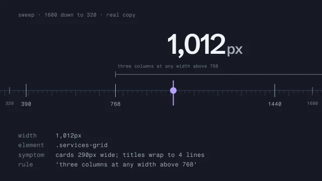
A break, recorded
1width 1,012px
2element .services-grid
3symptom cards 290px wide; titles wrap to 4 lines
4rule 'three columns at any width above 768'
The rule, changed (CSS)
1/* the patch: another breakpoint */
2@media (max-width: 1020px) { ... }
3
4/* the fix: a rule based on the content */
5.services-grid {
6 grid-template-columns:
7 repeat(auto-fit, minmax(min(18rem, 100%), 1fr));
8}

A fictional garden designer’s services grid, which broke at a width between the usual review sizes.

From the skill Test responsive behavior across every width · fictional client

Where yours go: Organize your project, in Prepare.

Full transcript

You checked the page at desktop, tablet and phone, and all three looked fine. Then someone zooms in to read, or narrows the window, and the order page breaks.

Here's the bakery's order page at the three reference widths: twelve-eighty, seven-sixty-eight and three-seventy-five. All three look fine, and they're good frames for screenshots and review. But people use every width in between and below. Three checks tell you about three points on a line, and nothing about the rest of it.

So keep both, for different jobs. The reference widths stay for screenshots and review. QA sweeps the whole range, down to three hundred and twenty. That number isn't about phones. WCAG's reflow rule uses three-twenty CSS pixels because that's what a twelve-eighty window becomes at four hundred percent zoom.

Use your browser's developer tools, or just drag the window narrower. Start at your widest width and go slowly, watching the page rather than the number. Stop at the first thing that breaks. At three hundred and sixty-two pixels, Morning buns is squeezed onto two lines, a word on each, by the price and the buttons beside it. Write down the width and the element, then find the rule behind it. This one says the name, the price and the buttons share one row, at any width. Three-seventy-five was fine, so no screenshot ever showed it.

Know what you're looking for. The page scrolls sideways. A line holds a word or two. Text spills out of its box. Buttons crowd together. An image stretches, or crops out its subject. Sweep with the real copy at its longest, and sweep up past your widest width too: a paragraph running the full width of a big screen is broken as well.

Here's a break recorded the same way for another fictional client, a garden designer. At one thousand and twelve pixels, the services grid still has three columns, and every title wraps to four lines. The last line is the rule that put it there.

The tempting fix is one more breakpoint at three-sixty-two. It works at that width, for these loaves. Then Morning buns go up to twelve fifty, and the row breaks again at three-seventy-three. So change the rule. When the price and the buttons don't fit beside the name, they move under it, at any width. Then sweep the whole range again, because changing a rule moves things. This time the row holds at every width, all the way down to three-twenty. And update the responsive rules you wrote before the build, so the next page follows the fixed one.

The garden designer's grid got the same treatment. Instead of another breakpoint, the grid holds as many columns as can each be at least eighteen rem wide, and the min with a hundred percent stops a card overflowing on the narrowest screens.

Screenshots at three widths are for review. QA is the whole range. When something breaks, find the rule that produced it and change that.

Three widths, or every width?

Reference widths (1280, 768, 375; Screenshots and review; Three points on a line). The sweep (Every width, from 320 up; For QA; The whole line).

Tools for the sweep

Measure and fix speed

Before you test, write down what you expect to be slow and why. Then measure, compare the result with your guess, fix the cause where it started and measure again.

What you’ll make

Before you start
The review build.
You’ll learn
Predict, measure, compare, fix at the source, measure again, using Core Web Vitals thresholds.
You’ll make
A speed check with guess, result and fix.
Worked example
The bakery’s speed check: fictional. No scores are shown here; the numbers go in the QA record when they’re measured.
Used next
The pre-send gate; the budget in the check routine.

Speed check

Copy or download your answers before you leave this page.

Measure with a test you can run before launch first, then with real visitors’ data once there’s enough of it.

Done when your guess was written before the test, the measured result sits next to it, and the cause was fixed at its source and measured again.

More

The continuing example: AllWeb

AllWeb’s old site, measured by PageSpeed on 5 October 2026: largest paint 4.7 s on a phone. The redesign, measured by SlapMyWeb on 7 October: about 3.8 s. Different tools, so compare like with like before you claim a gain.

Example project files
A prediction, written first
1page Home (phone)
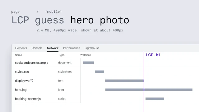
2LCP guess queue photo: 1.3 MB, 4000px wide,
3 shown at 375px
4CLS guess none; the photo has its size
5INP guess little to tap on Home; likely fine
Fixed once, in the image component (code)
1<img src={src} srcSet={srcSet} sizes={sizes}
2 width={w} height={h}
3 loading={isHero ? 'eager' : 'lazy'}
4 fetchPriority={isHero ? 'high' : 'auto'}
5 alt={alt} />

A fictional bike shop’s guess, in the three numbers speed tests report.

From the skill Predict, measure and fix performance · fictional client

Where yours go: Organize your project, in Prepare.

Full transcript

Run a speed test, fix whatever turns red, and you'll get a faster page this once. On the next project you'll be just as surprised.

There's a better loop, and it starts before any test runs. Predict what will be slow, and write it down. Measure. Compare the two, because the gap between your guess and the result is what you learn from. Then fix the slow thing where it's made, and measure again.

Here's a prediction for the bakery's homepage, on a phone. I think the queue photo at the top is the slow part, and loading will go over the line. The file is four thousand pixels wide and one point three megabytes, and on a phone it's shown three hundred and seventy-five pixels wide. I think nothing will jump, because the photo has its width and height. And there's little to tap on that page. That took two minutes. It's written down, so I can't quietly rewrite it once the results come in.

The three numbers are Google's Core Web Vitals, and Google sets what counts as good. Largest Contentful Paint is loading: two and a half seconds or less. Interaction to Next Paint is how quickly the page answers a tap or a keypress: two hundred milliseconds or less. Cumulative Layout Shift is how much things jump: point one or less. Google judges them at the seventy-fifth percentile of page loads, so most visitors need a good experience, including the ones on old phones.

Now measure. A lab test is one simulated load, so it works before anyone has visited, and it's good at pointing to causes. Here's the bakery's homepage, loaded five times on a phone with the connection and the processor slowed down. Loading takes seven point eight seconds, three times the line, and the largest element is the queue photo. Layout shift is point zero three, under the line. Responsiveness needs someone tapping, so one lab load can't judge it. Try the buttons yourself, on a phone. Real visitors' data covers the last twenty-eight days, and before launch there isn't any. So read the lab result as evidence about causes, not as a grade.

Then compare the guess with the result. The photo, as I guessed, and loading well over the line. Jumping: I guessed none, and the text moved a little when the fonts arrived. It's under the line, but my picture of the page missed it, so it goes in the log. Responsiveness I'll test by hand. And next time, I'll check the fonts first.

Most fixes make the slow thing smaller, or make it arrive after the things that matter. Google's own guides are specific: give images a width and height so their space is reserved, reserve space for anything that arrives late, never lazy-load the main image, and don't let the font hold the text back.

Then fix it where it's made. Every photo on the site goes through one small image helper, and right now it sends out the file that came in. So it was never only the queue photo's problem. Fix it there. Each photo now comes in two widths, eight hundred and sixteen hundred pixels, and the browser picks the one it needs. It keeps its width and height, so the page saves room for it. The hero loads straight away with high priority, and everything else waits until it's needed. Write it once, and no page can forget. Then measure again, against a new guess written first: under two and a half seconds, because the photo now arrives at the size it's shown. Loading now takes half a second. The small jump from the fonts is still there, under the line, and it's logged.

Write the guess down before you run the test. The gap between them is what you learn, and the fix belongs where the slow thing is made.

The three numbers, and two ways to measure
  • LCP ≤ 2.5 s: main content appears
  • INP ≤ 200 ms: responds to input
  • CLS ≤ 0.1: nothing jumps
  • Judged at the 75th percentile

Lab: a speed test: one simulated load; works before launch; good for finding causes. Field: real visitors: real visitors, last 28 days; needs enough real traffic; what the thresholds describe.

Tools for speed

Online tools need a public address: a noindexed or password-protected review build won't work in them. Test those with a coding agent and Chrome DevTools, or with Lighthouse on your own machine.

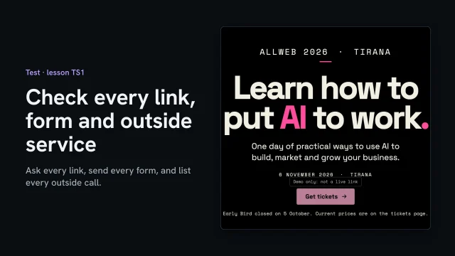
On the review address, ask every link for its answer, send every form the ways a visitor might, and list every outside service the page loads. Write down how you checked each one, not only that it passed.

Before you start
  • A review address
  • The site’s forms, built with their failure states
  • The QA record, started with the brief review
You’ll learn
  • Asking every link for its answer, following redirects
  • Why a 200 isn't proof for a video page, and what to ask instead
  • Checking that links that can't be real yet say so
  • Sending every form four ways and reading the inbox
  • Listing every outside service the page loads
You’ll make
Lines in the QA record (qa/record.md): each link, form and outside service, how it was checked, and what it found.
Worked example
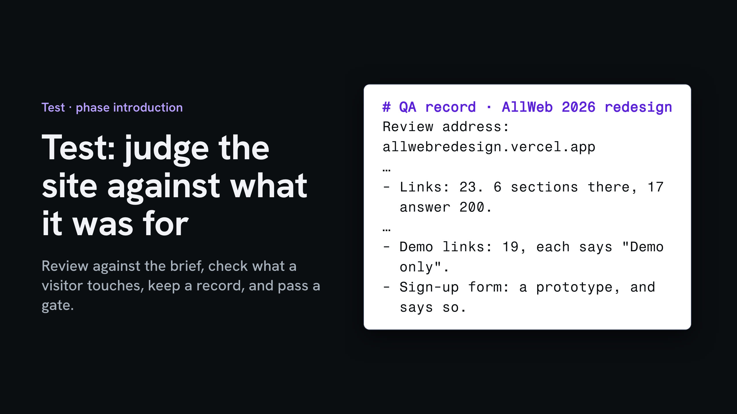
AllWeb's redesign, 1 Nov 2026: 23 links (6 sections on the page, 17 answer 200), 9 of 9 talks confirmed by the video service, 19 demo links each labeled, a prototype sign-up that sends nothing (0 requests), the bakery's order form sent four ways with one order in the inbox, and one outside service: the host's visitor count.
Check it
Every link, form and outside service has a line saying how it was checked and what it found.
Used next
Check security and privacy next; then the pre-send gate points at this record.

Done when every link, form and outside service has a line in the QA record saying how it was checked and what it found.

Check security and privacy

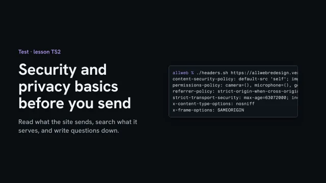
Read the security headers the review address sends and say what each one does. Search everything it serves for secrets, ask for files that must never be served, and list what the page collects and who it talks to.

What you’ll make

Before you start
  • Secrets kept out of files and deployments
  • A review address
  • The links and forms check
You’ll learn
  • Reading the security headers and saying what each does
  • Searching what's served for secrets, and reading every hit
  • Asking for files that must never be served
  • Checking every request uses a secure connection
  • Writing legal and client questions down as questions
You’ll make
A security and privacy section in the QA record (qa/record.md), each line with how it was checked, and the open questions for the client.
Worked example
AllWeb's redesign, 1 Nov 2026: six security headers; one search hit, a comment about design tokens; the environment file, version history, host link and brief all 404; http redirects to https; one prototype form and the host's visitor count; a question for AllWeb about the sign-up and the privacy notice.
Check it
Each check has a line with how it was run, and anything that needs a lawyer or the client is written as a question, not an answer.
Used next
The pre-send gate re-runs these lines on the version that’s sent.

Security and privacy

Copy or download your answers before you leave this page.

Say what you see. Anything that needs a lawyer or the client goes down as a question, never as an answer.

Done when each check has a line in the QA record with how it was run, and every legal or client question is written down as a question.

More

Example project files
strict-transport-security: max-age=63072000; includeSubDomains; preload
1x-frame-options: SAMEORIGIN
2referrer-policy: strict-origin-when-cross-origin
3permissions-policy: camera=(), microphone=(), geolocation=()
4content-security-policy: default-src 'self'; …
5x-content-type-options: nosniff

From the skill Security and privacy basics before you send · fictional client

Where yours go: Organize your project, in Prepare.

Full transcript

You don't need to be a security engineer to catch the common mistakes. Five checks, run on the review address, each written down: the headers the host sends, nothing private in what's served, secure connections everywhere, what the page collects, and who it talks to.

Start with the headers. Ask the address for them, and say in one line what each one does. This one tells browsers to use a secure connection only, for two years. This one stops other sites showing the page inside theirs. This one shares only the domain when a visitor follows a link away. This one switches off the camera, microphone and location. And the content policy lets the page load scripts, styles, fonts and images from its own address, and nowhere else. They're set once, in the project's settings file, so every page gets them.

Next, nothing private in what's served. Download the files the page uses, and search them for key, secret, token and password. One hit. Read it before you panic: it's a comment about design tokens, measured from AllWeb's own campaign art. Then ask for the files that must never be served: the environment file where keys live, the version history, the link to the host, and the brief. Each one answers not found.

Third, a secure connection everywhere. Plain http answers with a permanent redirect to https. Then search the served files for addresses that start with plain http. Two, both labels inside a small drawing in the stylesheet, not requests.

Fourth, what the page collects. One form, the sign-up, and the link check showed it sends nothing yet. The page's own script sends nothing either. The only one that reports anything is the host's visitor count. Last, who the page talks to: nobody else, and the content policy holds it to that.

Write each check into the QA record, with how you ran it. Anything that needs a lawyer or the client goes down as a question, not an answer. Once the sign-up is live, who gets the addresses, and what does the privacy notice say? That's for AllWeb to decide, with someone qualified.

Read what the site sends, search what it serves, and write questions down, not verdicts.

Run the pre-send gate

Before anyone outside sees the site, run the same fixed list on the version that’s actually live, not the one you remember. If a line fails, stop, fix it at the source and run the whole list again.

What you’ll make

Before you start
Every Test record.
You’ll learn
One fixed list run on the live version, stop on a fail, fix, rerun all, sign with version and date.
You’ll make
A signed pre-send gate.
Worked example
The bakery’s pre-send gate: the first run failed on one line. It was fixed and the whole list run again.
Used next
Go live, then Improve.

Pre-send gate

Signed

Copy or download your answers before you leave this page.

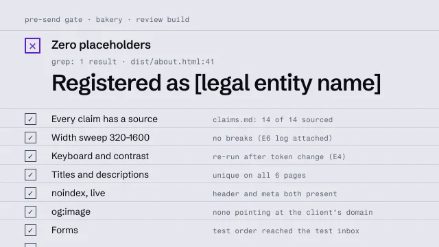
Search every page people can reach for square brackets and CONFIRM; reading the pages won’t find them all. Check what the live address sends, by any method, and write down how.

Done when every line of the gate passes on the live version, and the gate is signed with who ran it, the date, and the version and address checked.

More

The continuing example: AllWeb

On a speculative site, the gate has one more line: the concept disclaimer is on every page. AllWeb’s footer says it: “Concept redesign by Annie Vickrey. Not affiliated with or commissioned by AllWeb.”

What Test leaves behind

Not a score. A QA record that says how each check was done, by whom, on which pages and which version; the findings, sorted; and this gate, signed by whoever ran it. A pass says only what it covered.

Example project files
A pre-send gate
1[ ] Zero placeholders on any reachable page
2[ ] Every claim on the page has a source
3[ ] Width sweep from 320 up: no breaks
4[ ] Keyboard and contrast checks re-run
5[ ] Unique title and description per page
6[ ] Review build: noindex served, checked live
7[ ] No og:image pointing at the client's domain
8[ ] Every form tested, reaches the right inbox
9[ ] Signed off: who ran it, on which version and address
Placeholders: search, don’t scan
1$ grep -rn 'CONFIRM' dist/
2$ grep -rnE '\[[A-Za-z ]+\]' dist/
3
4dist/about.html:41 Registered as [CONFIRM: the company’s registered name]
5
6Any result = no send.
Checking noindex on the live review address
1$ curl -sI https://<review-url> | grep -i robots
2x-robots-tag: noindex
3
4$ curl -s https://<review-url> | grep -i robots
5<meta name="robots" content="noindex, nofollow">

The searches are shown with command-line tools over the built pages. A site search, or opening each address and searching its source, does the same job.

From the skill Run a pre-send gate · fictional client

Where yours go: Organize your project, in Prepare.

Full transcript

Sending the link is the one step you can't take back. Once the client has it, what's on the page is what they saw, and anything a search engine found is already found.

So before any build leaves you, it goes through a gate. A gate is a fixed checklist, the same every time, that the build has to pass before you send it. The fixed part matters. A list you make up on the day catches what you happen to be worried about that day, and what goes wrong is usually the thing you weren't worried about.

Here's the shape of mine. Each line is a check with a clear pass or fail, and almost every one points at a skill you've already met. Placeholders and claims come from never inventing a fact. The sweep is the responsive lesson. Keyboard and contrast come from accessibility. Then search and indexing, then forms, and a sign-off line that records who ran it and on which commit, so a pass still means something next month. Both of the incidents you've just heard about would have been stopped by a line on this list.

Placeholders get their own step, because your eyes will slide straight past them. You've read that page twenty times. So search for them instead of looking. Run a search across the built site, the files that actually get served, for your placeholder marker and for anything in square brackets. If it returns a single line, the build doesn't go. Fill it with a confirmed fact, or take the sentence out.

Search checks belong in the gate too, and a launch build has its own set. Every page has its own title and description. Each page lives at one address. The sitemap lists the real pages. Structured data states only what you've verified, because schema is a claim like any other. And the noindex you used on review builds is gone, which is an easy one to forget. For the mechanics behind each of these, Google's SEO Starter Guide is the place to learn them.

A review build is the opposite case. It has to stay out of search, and you check that on the live address, not in your code. Two facts make the difference. Google says that if robots.txt blocks a page, its crawler never sees the noindex, and the page can still turn up in results. And on Vercel, preview deployments get a noindex header automatically, but the current production address ending in vercel dot app doesn't. If your review link is a production deployment, nothing has been added for you.

This is the whole check. Ask the live address for its headers and look for the robots header. Then fetch the page itself and look for the robots meta tag. My gate asks for both. Two lines of output, and if either one is missing, the build isn't ready to send.

When a line fails, the build doesn't go. Fix the failure where it started. Then run the whole gate again, from the top. A fix in one place can break something in another, and a gate you only half re-run has stopped being a gate. Then sign it, with the commit it passed on.

You can ask an agent to run every command on this list, and you should, because it's faster and it doesn't get bored on line seven. But the sign-off is yours. Read what each check returned before you tick it. An agent that reports all clear without showing you the output is telling you a story about a pass.

Nothing leaves without passing the same list. Search for placeholders, check noindex on the live address, and send only on a pass.

When a line fails
  1. Stop. Don't send.
  2. Fix it at the source
  3. Re-run the whole gate
  4. Sign it with the commit

Believed: it's in the template; robots.txt will keep it out; the host handles it. Verified: headers fetched from the live url; meta tag seen in the live source; deployment type checked.

Tools for the last checks