Design

A chosen look, written down as a brief and a list of named values that whoever builds the site can check their work against.

0 / 8 complete

Starts with
The brief, Content model, Wireframe, Brand evidence, The old site’s audit
Produces
Art-direction brief, Graded imagery, Tokens
Feeds into
Build

Production Checklist

  1. Video, 1:24 Introduction to Design Introduction
  2. Video, 3:48 Read a look area by area Makes: Look reading
  3. Video, 3:59 Read an Aesthetary record Optional
  4. Video, 5:59 Why AI dashboards look like slop Optional
  5. Video, 2:18 Check the moodboard Makes: References
  6. Video, 3:16 Develop three directions, then choose Makes: Directions
  7. Video, 2:53 Set type and color that pass Makes: Type and color
  8. Video, 2:19 Grade every photo to one look Optional
  9. Video, 2:32 Cut-outs and composite heroes Optional
  10. Video, 2:17 Prepare images for the web Makes: Web-ready images
  11. Video, 3:41 Write the art-direction brief Makes: Art direction brief
  12. Video, 6:09 Prompt Claude for a dashboard that answers Optional
  13. Video, 3:08 Spot the AI-design tells Makes: AI-tells check
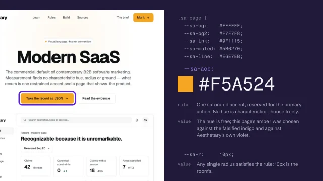
  14. Video, 3:35 Turn it into named values Makes: Spec and tokens

Read an Aesthetary record

Tell a documented rule from Aesthetary's reading, and a look's rule from a writing system's.

More

Full transcript

You're about to paste a record into your agent and say 'build this'. Some of those rules come from a source. Some are the record's own reading. A few belong to a written language and have nothing to do with the look. The record tells you which, if you know where to look.

Every rule on a record carries a label for the kind of claim it is. That's the standard this course sets itself: you should be able to ask 'is this part of the aesthetic, or your recommendation?' and get the answer without reading a footnote.

These are the ones you'll meet most. Documented means a source states it, and the source is attached. Seen in the work means someone inspected real artifacts and observed it. Our reading is the record's own conclusion from the material; no single source says it. Web translation is how the record applies the language on screen, which the aesthetic itself never specified. And Not part of the aesthetic marks an accessibility floor or current practice that would apply to any build. That last one matters more than it looks. A contrast rule printed on the Swiss record isn't Swiss, so nobody gets to cite it as the style, or drop it because the style didn't ask for it.

Here's Swiss Style's agent guide. Flush left, ragged right is ranked necessary, and it's seen in the work. The column count for screens is the record's own reading: the period work was print, so somebody had to decide. The contrast line is a floor for any site. Three rules in one guide, and you treat each differently. Break the first and it isn't Swiss. Change the second with a reason. Never drop the third.

There's a second label, and it's separate. Evidence says how the claim was established, and the kind never stands in for it. Strength is a third thing, from necessary down to unreliable, and 'our ranking' means the record set the tier, not a source. Two evidence labels catch people out. Not researched yet means nobody has looked, so it's neither permission nor a blank to fill. No grade recorded means the record simply doesn't say.

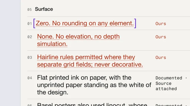
On a record, what the record decided itself is set in red with a dotted underline, and labeled Ours. On the Swiss Style record, 'Zero. No rounding on any element.' is marked that way, because that's the record's decision, not the source's. Ours on a record page and Our reading in a guide are the same kind. Square brackets mean something else here: a gap in a draft that has to be filled before anyone sees the page. Borrow the habit for your own briefs, so a client can see what came from them and what came from you.

A rule like 'set it vertically, read right to left' belongs to Japanese writing. Manga uses it because manga is Japanese. Carry it into an English-language site and what you've built is a mangled writing system. So rules on a record can be scoped to a script, and where a rule has no script recorded, the record says exactly that.

Swiss Style has a live case. One of its elements declares a left-to-right reading order. Reading direction belongs to a writing system, and nothing records which one this describes, so the record won't hand it to your agent as an instruction. It sits under open questions instead. No writing system recorded doesn't mean Latin. It means nobody has established which script the rule describes. That guards against a quiet failure: a mostly Latin corpus starts treating Latin as the default, and every other script as a deviation. If you build for Arabic or Japanese readers, check a rule's script before you trust it.

So before any rule goes into your brief, read its kind. Then its evidence. Then check whether it's scoped to a script. A necessary rule you keep. A reading of ours you may adapt, with a reason. An open question you hold until somebody answers it.

Know what kind of claim you're building on, and whose rule it is.

Why AI dashboards look like slop

Spot the four structural tells that make a polished AI dashboard useless, and fix the first: put the answer at the top.

Silent for now, so the captions are on. Savva’s own narration is coming.

By Savva Sicevs, Contributor6 min video

More

Full transcript

Dashboards That Work, part one: why AI dashboards look like slop.

Ask an AI tool for a dashboard and you get the same screen: a row of stat cards, one chart, a table and a sidebar. It looks clean, and people still call it slop. Savva tested this with a design grader he's building, which checks public design rules such as contrast, text size and spacing. Dashboards built with AI passed seventy percent of the rules on average. Real status pages and analytics tools passed sixty-six to sixty-nine percent, and finance apps fifty-four. By the rules, the AI screens are as good or better. His conclusion: the rules check hygiene, and slop is about what the screen is for.

Here's the kind of screen an AI gives Wickerloaf, the fictional bakery from this course. The owner takes orders ahead for pickup, and she opens this at half past six every morning. Six cards, the same size, each in its own color. What should she do first?

The first tell: there's no answer at the top. Everyone opens a dashboard with a question. Is anything broken? Which of these needs me right now? This screen opens with totals instead. Forty-two orders this week is just a number. Savva points to Stephen Few, who wrote Information Dashboard Design, on a total shown on its own: compared to what? Is this good or bad? The fix starts before any design. Write one sentence: who opens this, what they want to know, and what they'll do next. For Wickerloaf, the owner opens it to find out whether any of this morning's orders can't be filled, and then she calls those customers. Now the top of the screen can say it. Two orders need a call, because the seeded rye came out three loaves short. Everything else either helps her believe that answer, or it waits.

The second tell: everything is equally loud. Every card the same size, the same weight, and its own color. It's what people mean when they say a dashboard looks like a Christmas tree. Blur your eyes and every block weighs the same. He quotes Nielsen Norman Group's guide to visual hierarchy: if everything is contrasted, then nothing stands out. So the answer gets the size, the place where the eye lands first, and the color. Everything else gets quieter.

Savva reads every dashboard at three speeds. A glance of about five seconds, to see if anything's wrong. A scan of about thirty seconds, to see what and where. And a few minutes of study, to understand why, and decide what to do. AI dashboards only serve the study. Everything is there, and it's no help when you have five seconds. Ben Shneiderman put the same order into his mantra for data screens: overview first, zoom and filter, then details on demand.

The third tell: it's never calm. A screen with something yellow on it every day teaches you to ignore yellow. Savva points to a Nielsen Norman Group study of smart home alerts from this year: with too many alerts, people stop reading them, and miss the one that matters. So when nothing needs the owner, the screen should look almost empty, and say so. Nothing needs you this morning. It says when it last checked. And the detail, all fourteen orders, is one tap away. That's what Nielsen Norman Group calls progressive disclosure.

The fourth tell is the worst one: a zero that lies. A morning with no orders, and an order system that didn't answer, look exactly the same if the screen shows zero for both. Nielsen Norman Group's first usability heuristic is visibility of system status: keep people informed about what is going on. So say that the data didn't load, and say how old it is. Orders couldn't load. The last update was at two minutes past six yesterday evening. Retry.

All four tells come from one gap. The AI doesn't know what the screen is for, or who is reading it, so it guesses. Part two is about telling it.

Your exercise. Take a dashboard you or an AI built, and write the one sentence it should answer. Mark which of the four tells you can see. Then fix the first one: put the answer at the top, with what it's compared to. You're done when you have a before and an after, and the after leads with your answer.

This lesson was adapted from Why AI dashboards look like slop, by Savva Sicevs. The bakery examples were added by Aesthetary. Read the original on his site, then go on to part two.

Prompt Claude for a dashboard that answers

Tell the AI the answer and the reader, use Savva’s prompt, and check the result with a five-second test.

Silent for now, so the captions are on. Savva’s own narration is coming.

By Savva Sicevs, Contributor6 min video

More

Full transcript

Dashboards That Work, part two: how to get Claude to design a good dashboard.

In part one, Savva named four tells: no answer at the top, everything equally loud, a screen that's never calm, and a zero that lies. They all come from one thing. The AI doesn't know what the screen is for, or who will read it, so it guesses. You have to tell it two things: the answer, and the reader.

Start with one sentence: who opens the screen, what they want to know, and what they do next. Savva's own example is a shop owner checking today's sales and the orders to ship. That sentence decides what goes at the top, and the AI can't guess it for you. For the bakery, the owner opens it to find out whether any of this morning's orders can't be filled, and then she calls those customers.

Then say who's reading. Give the same screen to someone who has lived in it for years, and to someone who opens it once a week, and one of them gets it in a second while the other stares at it. Savva cites a NASA study from nineteen eighty-six. Researchers regrouped dense Space Shuttle displays into cleaner ones. People without expertise got much faster and more accurate. Experts made fewer errors, but weren't any faster, because they already knew where to look. Stephen Few puts it simply: where the lines are drawn depends entirely on the audience.

For a reader who's new to it, the answer has to be impossible to miss. Make it the biggest thing, put it where the eye lands first, and give it the color. For the bakery owner, that's the two orders that need a call. The supporting numbers stay: orders ahead today, and the change on last Tuesday. They get smaller type, and gray, where the answer gets color.

For an expert, you can turn it down. Wickerloaf's head baker reads this every morning to plan the next bake, so the head baker's version is denser. Every loaf, what was ordered and baked, what's left, and the change on last week, with quieter accents. Right for the person who reads it daily, and hard for anyone else.

Two states need rules of their own. When nothing needs attention, the screen says so, and stays mostly empty. And when the data doesn't load, it never shows zero. It shows that it failed, and how old the last update is.

Detail goes somewhere it can wait: a tooltip, a side panel, or a second page. Tap the seeded rye, and a panel opens with the history behind the answer.

Here's Savva's prompt. You paste it before you ask for the screen, and fill in the brackets. First it asks Claude to write one line and show it to you: who opens this screen, to find out what, and what they do next. Then it names the reader: new to this, or an expert who uses it every day. Then seven rules. The answer goes at the top as a condition, and it's the biggest thing on the screen. Color only for the answer, and for up or down. One block stands out. When nothing needs attention, say so. Never show zero for data that didn't load. Detail goes in tooltips, panels or a second page. And a new reader gets one answer, a few numbers and one chart, while an expert gets more, with quieter accents. The full prompt, ready to copy, is in Savva's article. The link is with this lesson.

If you'd rather not paste it every time, put the rules in a Claude skill, which Claude uses automatically when it's relevant. Savva publishes his own, the Style kit, as a Claude plugin.

Then check it in five seconds. Show the screen to someone close to the real user, for five seconds, and ask what they saw. If they say the answer, two orders need a call, it works. If they name the loudest thing on the screen, and it isn't the answer, the accent is in the wrong place. And if only someone who already knows the bakery gets it right, you've built an expert screen. That's fine, as long as experts are who will use it.

Your exercise. Write the answer sentence and the reader for a dashboard you need. Run Savva's prompt, copied from his article. Show the result to one person for five seconds, and write down what they said. You're done when you have the sentence, the screenshot and their answer, plus one change if they named the wrong thing.

This lesson was adapted from How to get Claude to design a good dashboard, by Savva Sicevs. The bakery examples were added by Aesthetary. Part one, why AI dashboards look like slop, is on his site too.

Grade every photo to one look

Measure warmth and brightness, fix the photos that are off, and apply one written grade to the whole set.

More

Full transcript

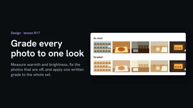
Five of the owner's photos for the site, taken on different days, in different light. Each one is fine on its own. Side by side, they look like five different bakeries. Grading makes them one set, and you can measure it instead of trusting your eye.

Measure two things in every photo. Brightness, from zero to two fifty-five. And warmth, read off something white in the shot, here the baking paper: how much redder than blue it came out. White is zero. The hands at the bench already look right: warm daylight, brightness one ninety-three, warmth plus twenty-seven. That's the house look. Three are far off. The shelf under the shop's lights is cold, minus forty-nine. The loaf at home, under a lamp, is orange, plus a hundred and six. And the counter is dark, at ninety.

Write the house look down as numbers: warmth, brightness one ninety, a soft contrast, and where white sits. Any photo editor has these controls. Here a small script runs the same steps on every file, so no photo gets a slightly different hand. Order matters. First make the paper neutral, which takes out each photo's cast. Then brightness, then contrast. Set the warmth and the white point last, because contrast moves them. Do it the other way round and you can see it. The white drifts from two forty-three to two forty-six, and the warmth slips to between plus twenty-one and plus twenty-four, off the house numbers.

One photo is left alone on purpose. The oven at five in the morning is lit by the oven itself, so it's meant to be dark and orange. It stays as shot, and the grade file says why. An exception with a reason is a decision. Without one, it's an accident.

Then measure again. Four photos at brightness one ninety, warmth between plus twenty-five and plus twenty-eight. The oven, as named. And look at them together, before and after, on one screen. The numbers say they match. Your eye tells you whether the set feels like one morning in one bakery.

Measure first. Fix the outliers to one written grade, in the same order every time, and name every exception with its reason.

Cut-outs and composite heroes

Cut out a photo you're allowed to change, check the mask, and set it on the page with a shadow only where it touches.

More

Full transcript

The Today's bread page needs a first picture, and the owner has a phone photo of the Country loaf on a sheet of baking paper. Cut out, the loaf can sit right on the page's own background. Done well, nobody notices. Done badly, it looks like a sticker.

Before you cut anything, check you're allowed to change it, because a cut-out is an altered photo. The owner took this one herself, and nobody's in it. Until she says yes to the change in writing, the manifest marks it unconfirmed, and it doesn't ship. A photo whose license says no derivatives can't be cut out and published at all. A supplier's product shot or a customer's photo needs their yes first.

The plain paper makes this easy. The script takes the paper's color from the border and removes everything that matches it, including the paper's own shadow. It keeps one piece: fifteen percent of the photo. Then look at the mask, not the result on the page. White is kept, black is gone. Along the top, specks of flour have been cut out as holes, a hundred and seventeen pixels of them, because flour is the color of the paper. Fill the holes, then pull the edge in one pixel and soften it over one, so no paper is left along it. At full size, the stepped edge is now smooth. Flour right on the edge, you fix by hand, or shoot again on darker paper.

The second photo, the loaf in its basket, fails outright. The script keeps thirty-four percent of the photo, more than twice the loaf alone: the basket is as brown as the crust, so it comes too. Use that photo whole, or not at all. Anything the color of its backdrop fails the same way: flour, steam, glass and shine.

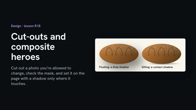
Now place it. A big, soft drop shadow, the default in many tools, makes the loaf float above the page like a sticker. Give it a contact shadow instead: dark and tight where the loaf touches, gone a little way out. The photo's light came from the left, so the shadow leans right. And don't add light, steam or a glow the photo never had. That's a claim about the loaf, made with pixels.

Last, the manifest. The cut-out gets its own entry: which photo it came from, what was changed, and who allowed it. Months from now, that entry is how anyone knows whose loaf this is, and that moving it was allowed.

Cut out only what you're allowed to change. Check the mask, not the page. And give it a shadow only where it touches.

Introduction to Design

Starts with
The brief, Content model, Wireframe, Brand evidence, The old site’s audit
Produces
Art-direction brief, Graded imagery, Tokens
Feeds into
Build

Read a look area by area

Before you borrow a look, or settle on your own, go through it one area at a time: does this area have to be there, and how is it handled? Where nobody has looked into an area, write that down instead of treating it as a free choice.

What you’ll make

Before you start
The wireframe and the brief.
You’ll learn
Reading a look area by area with two questions per area (presence, handling), and ‘silence never becomes permission’.
You’ll make
A reading of your direction, area by area.
Worked example
The bakery’s direction, read area by area: the bakery read its own direction the same way it would read one it borrowed.
Used next
Directions.

Reading a look

Area 1
Area 2
Area 3
Area 4
Area 5

Copy or download your answers before you leave this page.

The ten areas that take a position: layout, typography, color, imagery, surface, interface, motion, motif, technique, form. Hierarchy and density, the other two of the twelve, hold rules but no position of their own. Answer the first question for each before you write how it’s handled.

Done when every area of the look has an answer, and each answer says where it comes from or that nobody has looked into it yet.

More

Spot what an AI chose for you

A tell is a design decision nobody made. These are the common ones in an AI tool’s first draft. If you can’t give the reason for one, the generator chose it.

  • Gradients, glows and pill buttons
  • Stock photos in place of real ones
  • Everything centered, gaps the same
  • Three identical icon cards
  • Filler lines and invented stats
A fictional bookbinder, three tells fixed
1TELL hero: headline, paragraph, two buttons
2FIX one sewn spine, full width; one action
3
4TELL icon cards: Handmade · Bespoke · Sustainable
5FIX cut; the photographs already prove it
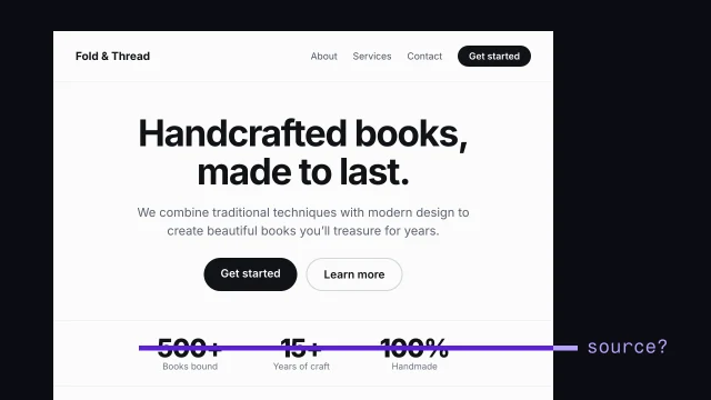
6
7TELL '500+ books bound'
8FIX removed until the bindery confirms a number

Aesthetary’s costume test, from the Quiet Luxury record: does the look still say what it should once the surface is made ordinary?

  1. Make the palette ordinary.
  2. Make the serif ordinary: a system sans.
  3. Halve the whitespace.
  4. Does it still communicate luxury?
  5. If no, it was relying on the costume.

The lesson: Spot AI-design tells.

If the screen is a dashboard

A dashboard has tells of its own: no answer at the top, and every number shouting at once. Savva Sicevs names four and fixes the first in Why AI dashboards look like slop.

Reading an Aesthetary record

Read an Aesthetary record: every rule in a record says what kind of claim it is (stated by a source, seen in the work, or Aesthetary’s own reading). Check that before a rule goes in your brief.

Common design mistakes

You don’t need design training to catch these. Each one is drawn as you might find it and as it looks fixed, with how to recognize it.

Generic AI design

A tell is a decision nobody made. Here is the bookbinder’s page as a coding agent first drafted it, with three tells marked.

Example: a fictional bookbinder. The generic first draft, and the page after its tells were fixed.

1Timeless craftsmanship

Premium but approachable bookbinding for every story.

Get startedLearn more

  • 2
  • Handmade
  • Bespoke
  • Sustainable

3500+ books bound

As generated
  1. 1

    Tell hero: headline, paragraph, two buttons

    Fix one sewn spine, full width; one action

  2. 2

    Tell icon cards: Handmade · Bespoke · Sustainable

    Fix cut; the photographs already prove it

  3. 3

    Tell '500+ books bound'

    Fix removed until the bindery confirms a number

Every spine is sewn by hand.

Structural repairs and new bindings, sewn in the workshop.

Ask about a repair

Fixed: direction A

A tell, or a choice?

A tellA deliberate choice
No reason but 'sites do this'Traces to the brief or concept
Survives any change of briefUsed where it earns it
Would change if the brief did

The costume test

  1. Make the palette ordinary.
  2. Make the serif ordinary: a system sans.
  3. Halve the whitespace.
  4. Does it still communicate luxury?
  5. If no, it was relying on the costume.

Aesthetary’s test, from the Quiet Luxury record.

The tells and fixes are the skill’s: Spot AI-design tells. “Timeless craftsmanship” and “Premium but approachable” are lines nobody can check, from Write an art-direction brief that survives the build.

  1. Weak hierarchy

    Spot it. Step back and squint. If nothing stands out, nothing leads, and the visitor has to decide what matters. Fix it. Decide the one thing each screen is for and make it the biggest. Each size in the scale stands for one rank. On a school’s term-dates page, that thing is the dates.

    Skill: Choose a typeface and build a type scale

  2. Poor contrast

    Spot it. Pale gray, or a brand color, as text on a light ground. Check the pair: WCAG 2.2 asks for 4.5 to 1 for normal text. Fix it. Change the color’s job before you change the color. The bookbinder’s gold stays, behind dark text. A public service can’t choose its readers: anyone may need it, on any phone, in bright sun.

    Skill: Build color roles and check contrast

  3. Inconsistent type

    Spot it. List every font size on the page. If two of them mean the same thing, the reader can’t tell which matters more. Fix it. Merge the sizes that share a rank, then count what’s left. Name each one by its job.

    Skill: Choose a typeface and build a type scale

  4. Decorative imagery with no purpose

    Spot it. Cover the picture. If the page loses no information, the picture was decoration. Fix it. Every image has to show the thing the words claim.

    Skill: Direct imagery: subject, crop and grade

  5. Inconsistent components

    Spot it. Two buttons that do the same kind of job but differ in color, corners or shadow. Each difference makes a visitor wonder if it means something. Fix it. Write one rule per component, with every state, and build every instance from it.

    Skill: Turn the direction into a specification and tokens

  6. Poor mobile layouts

    Spot it. Open it on a phone. Is the main thing still the main thing, and can you reach the button with a thumb? Fix it. Write responsive rules as rules: what reorders, what stacks, what hides, and what never changes. Every crop has to survive the phone.

    Skill: Turn the direction into a specification and tokens

  7. Misleading visual claims

    Spot it. A number, review, logo or badge nobody can point to a source for. A design can make a guess look like a fact. Fix it. Removed until the bindery confirms a number. Testimonials wait until there are real ones.

    Skill: Spot AI-design tells

  8. A direction that contradicts the position

    Spot it. Read the business’s position, then look at the page. Would a stranger guess it? Watch for the literal choice: “Luxury”, so a thin serif. Fix it. Choose type and look from what the site must do and what the business can prove. A food bank dressed as a luxury brand makes donors wonder where the money went.

    Skill: Choose a typeface and build a type scale

Drawn examples, for a fictional bookbinder. Contrast figures are the skill R8’s.

Full transcript

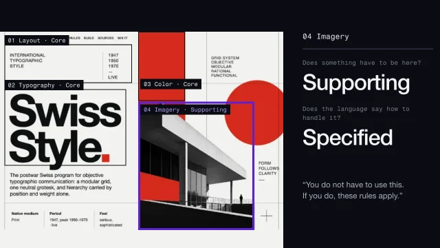
Ask someone to describe Swiss Style and you'll hear grid, Helvetica, red. Of those three, the Swiss Style record requires only the grid, and the description skipped nine areas entirely. Here's how to read a look so nothing gets skipped or assumed.

Every record describes its look in the same twelve areas. Layout is how the surface is divided. Typography is letterforms and how text is set. Color asks how many colors do work, and what each one is for. Imagery is what pictures are allowed to do. Surface is what the page is made of. Interface is radius, borders and elevation. Then motion, motif, the production technique the look depends on, and form, which is three-dimensional organization where a language has one. Hierarchy and density work differently. They hold rules, but they have no overall position of their own. Context sits apart and is never scored: 'also called International Typographic Style' is true, and tells you nothing about where a heading goes. Because the set is fixed, you can write your own direction in the same twelve and lay it next to any record.

Ten areas carry an overall position, and each one gets two questions, answered separately. Does something have to be here? And if it is, does the language say how to handle it? Swiss Style shows why they come apart. Imagery is supporting, so you don't need pictures at all. Use them, though, and the record is strict: photographs treated as objective records, placed by function. Optional presence, constrained treatment. Merge the two questions and you lose that.

Open the Swiss Style record from Explore and scroll to Build. The record lists its areas, each with a state, and the states are precise. Core means the language isn't itself without this. Ruled out means adding it builds something else. Not specified by the source means the area doesn't apply. Interface and motion both postdate the language, so there's no position to record, which is a different thing from a position against them.

This is the distinction that does the most work. 'The language lets you choose' and 'nobody has looked into it' read the same in a careless write-up. They're opposite instructions. Swiss Style's technique area is the first kind: historically offset litho, but nothing in the language requires a process, so you choose. Japanese Minimalism's record says outright that its positions by area aren't researched yet. Same blank look. Completely different license.

The record's rule for this is four words. Silence never becomes permission. When an area is unresearched, you don't fill it with whatever sounds right for the name. You decide it from your brief and your client's evidence, and you write down that that's what you did.

Then turn the frame on your own work. Write all twelve headings before you write anything else, so no area gets skipped for being boring. For the ten with a position, answer the presence question in a word: core, supporting, ruled out. Then write the handling. And wherever you haven't decided, or have no evidence, write exactly that.

Here's a first pass for a fictional bookbinder, all twelve areas. Look at motion, motif and technique. Motif is ruled out, a decision. Motion says not decided, and technique says not researched. Those two honest lines will save you an argument with your agent later. 'Motion: not decided' is useful. A blank invites the AI to fill it with its default, and then claim the brief allowed it.

Every area gets two questions. And silence stays silence.

Tools for Design

Design has more tools than any other stage, and most of them are optional. These are a starting set, grouped by the question each one helps with.

Typography

Helps answer: Which typeface, and what sizes?

  • Google Fonts (opens in a new tab)

    fonts.google.com · Google · Official tool

    Free web fonts.

    For Design: Audition candidates on the client's real headline, every one at the same sizes, before you choose.

  • Type Scale (opens in a new tab)

    typescale.com · Tool

    Modular type scales.

    For Design: Try a scale, then keep only the sizes that stand for a rank, and name them by their job.

Color and contrast

Helps answer: Can everyone read it?

Imagery

Helps answer: Where do usable pictures come from?

  • Unsplash (opens in a new tab)

    unsplash.com · Asset library

    Editorial-quality photos, API.

    For Design: The photograph on this page comes from here, standing in for a client shoot. A stand-in shows the layout; it can't prove the work.

  • Wikimedia Commons (opens in a new tab)

    commons.wikimedia.org · Asset library

    Search CC-licensed media.

    For Design: Openly licensed images, including historical material. Each file states its own license and the credit it asks for.

Inspiration

Helps answer: What does good look like?

Look for how strong sites solve a problem, then leave their look behind. Copying a reference's surface is how directions end up generic.

  • SiteInspire (opens in a new tab)

    siteinspire.com · Reference

    Landing pages / one-pagers / award sites / motion.

    For Design: A curated gallery with a high bar, for seeing how good sites handle one kind of section.

  • Recent.design (formerly Godly) (opens in a new tab)

    recent.design · Reference

    High-end site gallery.

    For Design: What's being made now. It's also how you learn the category default you're steering away from.

Accessibility

Helps answer: Will it work for everyone?

  • Understanding Contrast (Minimum) (opens in a new tab)

    w3.org · W3C WAI · Standard

    The WCAG contrast rule (4.5:1, or 3:1 for large text) and why it exists.

    For Design: The rule behind every contrast number on this page: 4.5 to 1 for normal text, 3 to 1 for large text.

    In Learn: Build color roles and check contrast

  • React Aria (opens in a new tab)

    react-aria.adobe.com · react-spectrum.adobe.com · Component library

    Adobe's a11y primitives.

    For Design: For developers: components that handle keyboard and screen-reader behavior, so the look you chose stays usable.

Design systems

Helps answer: How does it stay consistent once it's built?

  • shadcn/ui (opens in a new tab)

    ui.shadcn.com · Component library

    Open-source component collection you copy into your own codebase rather than install as a dependency.

    For Design: Components you copy into the project and restyle with your own tokens, so the direction reaches every page.

  • Penpot (opens in a new tab)

    penpot.app · App

    Open-source Figma alternative; design tokens native; has MCP/plugin ecosystem.

    For Design: An open-source design tool with design tokens built in, so the file and the specification can share names.

All 135 resources for Design

Every tool here is made by someone else. Aesthetary isn't affiliated with any of them, and listing one doesn't mean its maker endorses Aesthetary.

If you own, make or teach this site
If you own or pay for the site
You choose which of the directions is true to the business. Ask to see the written specification as well as the mockup: the type, the colors and the rule for every button.
If you make it
You turn the chosen direction into values a coding agent can follow: tokens, a type scale, components with every state. Check the contrast of every color pair.
If you teach it or run a program
Practice the costume test on a page: what would a stranger guess about the business? Assess a direction by whether its rules could be checked by someone else.
Standards Design is checked against (7)

Aesthetary's own rules here

  • Aesthetary rule Generated imagery is never used as evidence

Laws are listed so you know they exist: Aesthetary links to the text and doesn't give legal advice. What these are, and every standard, in Resources

Where the looks come from

Researched visual languages and their parts, to read before you borrow: Aesthetics, Elements, Favorites.

The AllWeb example

AllWeb’s brief (Annie’s speculative redesign) reads its own look the same way: palette roles, type, photography, motif, and what it won’t do.

Check the moodboard

Take one principle from each reference and write it as a sentence you could check on the finished page. Then check every logo, number and typeface on the moodboard against the brand’s own sources.

What you’ll make

Before you start
A moodboard (yours, a designer's or an image generator's), the references you collected, and the brand's own sources: its live site and the marks it really uses.
You’ll learn
Reading each reference for one principle written as a checkable sentence, instead of copying its look; checking every logo, number and typeface on a moodboard against the brand's own sources.
You’ll make
design/references.md: each reference with its one principle, and everything crossed out with where it was checked.
Worked example
The AllWeb redesign's moodboard (~/AllWeb/AllWeb Conference Brand Moodboard.png) and site/BRIEF.md "References, as principles": OFFF Barcelona and Web Summit. Crossed out after checking: the AW monogram (AllWeb's marks are the wordmark and the speech bubble), "120+ speakers & panels" (allweb.digital says 120+ partner brands), Inter (no reason; Space Grotesk is Space Mono's sibling). File: `scripts/learn-video/demo-site/allweb/DS1/design/references.md`.
Check it
Done when every reference has one principle you could check on the finished page, and every mark, number and typeface on the board is either confirmed from the brand's own source or crossed out.
Used next
Develop three different directions, then choose (R10); the art-direction brief (R12) lists the principles and what's crossed out.

References and moodboard

The board

Checked against the brand

Reference (address or image) 1
Reference (address or image) 2
Reference (address or image) 3

Copy or download your answers before you leave this page.

A moodboard makes claims about the brand. Treat it like any other evidence: nothing on it reaches a page until it’s checked.

Done when every reference has one principle you could check, and every mark, number and typeface on the board is confirmed from the brand’s own source or crossed out.

More

Full transcript

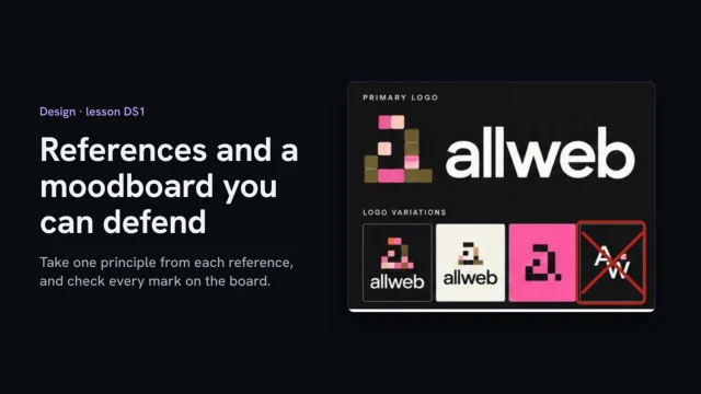
This moodboard was the starting point for my speculative redesign of the AllWeb conference site. AllWeb didn't commission it. It looks finished, and that's the risk. A board like this makes claims about the brand: its marks, its colors, its type, even its numbers. So before any of it reaches a page, check it the way you'd check any other evidence.

Start with the references. The board shows four other events' sites, each with a few words beside it. Words like creative confidence describe a mood, and you can't build a mood or check one. So I kept two references and took one principle from each, written as a sentence. From OFFF Barcelona: let the event have an aesthetic, and let the type and art carry it. From Web Summit: the ticket button is always one move away, and the date and city never fall below the fold. Each one is now a sentence you can check. On a phone, the date, the city and the ticket button all sit on the redesign's first screen.

Then check every mark. The board shows four versions of the logo, and one is an A-W monogram. AllWeb's own marks are its wordmark and a speech bubble. The monogram isn't one of them, so it's crossed out. The redesign's header uses the real wordmark file instead of typing the name. Numbers are claims too. The board says a hundred and twenty plus speakers and panels. AllWeb's own site says a hundred and twenty plus partner brands. Same number, different claim. The redesign uses the site's words, and the board's line is crossed out. Type gets the same question: why this one? The board keeps Inter for body text, the face the current site uses, and it says nothing about AllWeb in particular. AllWeb already sets its labels in Space Mono, and Space Grotesk was drawn from Space Mono. So Space Grotesk does both jobs, and no new family comes in.

Write it down in one short file: each reference with its principle, then each thing you crossed out and where you checked it. The art-direction brief picks this file up later, so the monogram never comes back.

Take one principle from each reference, and check every mark before it reaches a page.

The AllWeb example

This is the lesson’s own file, design/references.md, written as the video shows. The art-direction brief picks it up later, so a crossed-out mark never comes back.

With this task: Read a visual language area by area, Write an art-direction brief that survives the build.

Develop three directions, then choose

Write three directions that disagree about what matters most, each with its own one big move. Then score them in writing against the site’s job before anyone says which they like.

What you’ll make

Before you start
The look reading, the brief, the category default.
You’ll learn
Three directions that disagree on their decisive move, the color-swap test, scoring against the job before taste.
You’ll make
Three directions and the written choice.
Worked example
The bakery’s three directions
Used next
Type and color, the art-direction brief.

Three directions

The directions

Choose against

The choice

Copy or download your answers before you leave this page.

The swap test: if swapping the colors makes two directions the same, you have one direction.

Done when you have three directions that stay different even with their colors swapped, a written reason for the one you chose, and the other two kept with the reason they lost.

More

Example project files
A fictional bookbinder, three directions
1A Morning queue documentary photos, early light
2 confident type; the queue and the bread lead
3B Flour and paper craft paper, hand-drawn labels
4C Notice board type only, like the board in the window
The bookbinder’s scores, in writing
1 A queue B paper C board
2One job strong medium medium
3Position strong weak weak
4Default clear crowded clear
5Risk low low high
6
7Chosen: A. The bread and the queue are on every
8screen, and that is what regulars come for.

Each direction leans on a researched Aesthetic. The scores were written before anyone said which they liked.

From the skill Develop three different directions, then choose · fictional client

Where yours go: Organize your project, in Prepare.

Full transcript

Ask an AI tool for three design directions and you'll often get one direction in three colorways. Same layout, same type, a navy one, a green one and a terracotta one. You can't choose between those on evidence, because they don't disagree about anything.

So why three directions? One direction gets approved by default. Two becomes a coin toss. Three gives the client a real comparison, and gives you room for one that's a risk. But the number only works if they disagree about something that matters: the one decisive move each direction commits to.

Here's the swap test. Take the palette from one and put it on another. If they now look like the same site, they were the same direction.

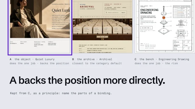
Here are three for the bakery. A, Morning queue: documentary photos in warm early light, and confident type. B, Flour and paper: craft paper and hand-drawn labels. C, the neighborhood notice board: type only, like the board in the window. Now put A's colors on all three. They stay three different sites, so these are three directions.

Then the order. Write your three directions before you open the records. Name the visual language each one leans on and what you expect its rules to be. Only then open the records. The gap between your prediction and the record is the useful part. If you look first, you'll never find out what you'd have assumed. Keep the predictions in the same file as the directions.

Develop all three to the same depth. One sentence naming the decisive move. The top of the home page. One inner page, because many directions look great as a hero and fall apart on a page of prices. And the type, with one real image from the client. If you finish your favorite and sketch the other two, the client will pick the finished one.

Choose against three things, and taste isn't one of them. The site's one job, from the brief. The position the business can back with evidence. And the category default: if every bakery site you found already looks like B, B has to work much harder. Score each direction in writing before anyone says which one they like.

Here's what that looks like for the bakery. All three can do the site's one job, getting regulars to order ahead. A backs the position best: bread, baked every morning, is on every screen. B sits right on the category default. The notice board lost the bread entirely. The decision is written down with its reason.

Then the part people skip. Don't blend the winner with the best bits of the losers. That averages three ideas back into the middle you were trying to leave. Keep one principle at most, written as a principle. From C: today's bread as a plain list, like the menu board. And keep the other two directions in the project folder, so when someone asks about them later, you can show why they lost.

If swapping the colors makes two directions the same, you have one direction.

The AllWeb example

AllWeb’s direction is “The room is the product”. It had one direction, not three; on a new project, develop three.

Set type and color that pass

Give every font size one rank and every color one job, starting from colors that have a source. Check every text and background pair the pages will use, and if a brand color fails, change its job before you change the color.

Also in this task

Build color roles and check contrast 4 min

The lesson’s own page, with its transcript

Direct imagery: subject, crop and grade 4 min

The lesson’s own page, with its transcript

What you’ll make

Before you start
The chosen direction and brand evidence.
You’ll learn
Auditioning type on real copy and a small ranked scale; color roles from sourced colors and contrast for every pair.
You’ll make
Type and color decisions with ratios.
Worked example
The bakery’s type and color
Used next
Specification and tokens.

Type and color

Type

Color

Copy or download your answers before you leave this page.

The minimum for normal text is 4.5 to 1, and 3 to 1 for large text, control edges and focus rings (WCAG 2.2 AA).

Done when no two sizes share a rank, every color has a source and one job, and every text pair meets 4.5 to 1.

More

Directing the photographs

Every picture has to show the thing the words claim. Write the claim each picture supports, brief the subject and the crop, and set one look for the whole set.

  1. Write the claim each slot supports
  2. Brief the subject, then the crop
  3. Set one grade for everything
  4. Review the set together
A fictional bookbinder, grade note
1GRADE warm daylight, never orange
2CONTRAST soft shadows, nothing crushed to black
3SAT slightly under; oxblood stays true
4NEVER filters, vignettes, added film grain
5CHECK every image side by side before launch
An asset plan, two slots
1SLOT Home, first image
2CLAIM 'Every spine is sewn by hand'
3SUBJECT needle through the fold, hands in frame
4CROP tight; thread crosses the frame edge
5SOURCE client shoot [CONFIRM: booked?]
6
7SLOT Repairs, before and after
8SUBJECT same book, same angle, same light

The lesson: Direct imagery: subject, crop and grade.

Example project files

Shown as CSS custom properties, one way a type scale is written for a website.

A fictional bookbinder, a scale named by rank
1--type-headline: 3.5rem; /* once per page */
2--type-page: 2.25rem; /* page headings */
3--type-section: 1.5rem; /* section headings */
4--type-read: 1.125rem; /* reading text */
5--type-small: 0.875rem; /* allergens, small print */

From the skill Choose a typeface and build a type scale · fictional client

Every pair the page will use, checked
1text on ground 14.6 : 1 pass
2action on ground 8.9 : 1 pass
3crust on ground 5.4 : 1 pass (headings)
4white on action 9.6 : 1 pass
5gold on ground 2.0 : 1 fails text and edges
6white on gold 2.2 : 1 fails
7text on gold 6.9 : 1 pass
8gold on text 6.9 : 1 pass
What you tell the client
1Your gold stays. It changes job.
2Gold behind dark text: the few-left badges.
3Gold as text: only in the dark footer.
4Gold link text on cream: 2.0 : 1. Unreadable.
5The numbers for every pair are attached.

From the skill Build color roles and check contrast · fictional client

Where yours go: Organize your project, in Prepare.

Full transcript

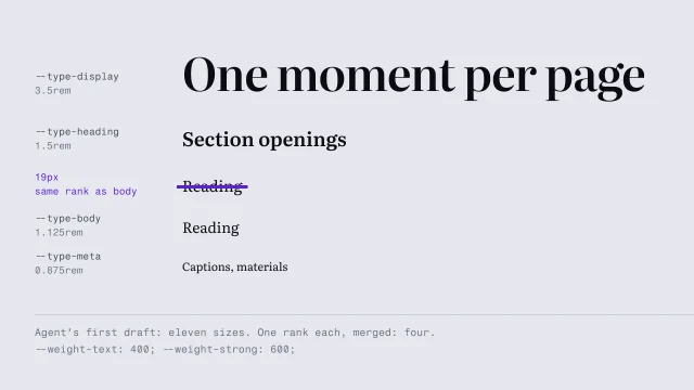
Open the styles on a page your AI built and list every font size it uses. If you find nine or ten, ask what the difference between nineteen and twenty pixels is supposed to mean. Nobody will know, because nobody decided.

Choosing a face starts with an audition. Placeholder text hides exactly the problems you're looking for. So set the client's real words instead. Here's the bakery's headline and two real lines, in three candidates at the same sizes. Then look at the parts that break. The numerals, because the bakery shows pickup times. The italic, because sooner or later the site quotes someone. And Young Serif has no italic at all, so the browser fakes one by slanting the letters. And read it at phone size. Plenty of faces that look wonderful at eighty pixels go faint at eighteen.

Then choose against the brief, not against the word. The literal move for a bakery is a warm, chunky serif. Ask what the face has to do instead. People read this site on a phone, in the queue, usually for one thing: what's left, and when it's ready. So the headline face has to hold up at phone size, and its numerals have to be plain.

For the bakery, that face is Literata. It stays clear at phone size, its numerals are plain, and it has a real italic. Everything people read gets a plain sans, down to the prices and allergens. One face for headings, one for reading, and each has a job the other can't do.

Now the scale. Keep it small, and give every step a job. If you can't say what a size ranks, it shouldn't exist. Two sizes that mean the same thing are a bug, and on the page they read as a mistake.

Here's the order page as an agent first built it. It uses ten font sizes. Write the rank each size carries. Where two sizes carry the same rank, merge them. Ten sizes become five: the headline, page headings, section headings, reading text, and small print such as allergens.

Here's the bakery's scale, five steps named by rank, so nobody types text-xl and wonders what it's for. The headline is about three times the reading size, and it appears once per page. When the biggest step is barely bigger than the headings, the page reads like a document.

Size isn't your only tool for rank, and leaning on it alone is how scales bloat. Position, weight and the space around an element all rank things. Swiss Style is the extreme case: hierarchy comes from position on the grid.

Then put the five into the tokens file, and tell your agent that any other size is a bug to report, never a value to invent.

Each size is a rank. If two sizes mean the same thing, delete one.

Color roles and contrast

Build color roles and check contrast: colors from evidence, one job each, and what to do when the brand color fails.

The AllWeb example

AllWeb’s brief records measured contrast rules: charcoal text on hot pink and lime, never cream (cream on hot pink is 2.7:1). Its photography rule is real AllWeb photos only, with one duotone so eight years read as one institution; its grading script does what R17 measures.

With this task: Is this image fit for its slot?, Grade every photo to one look, Cut-outs and composite heroes.

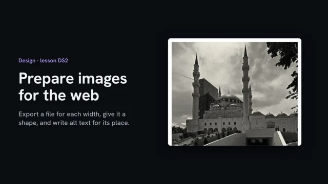
Prepare images for the web

For each image in the asset list, make a file for every width its slot is shown at, give the page its width and height, and load it lazily only below the first screen. Write alt text for what it shows in that place, then check in a browser which file a phone loads.

Also in this task

Is this image fit for its slot? 3 min

The lesson’s own page, with its transcript

What you’ll make

Before you start
Approved, graded photos with their rights checked, and the asset list saying where each one appears.
You’ll learn
Exporting a file for each width a slot needs, in a modern format at one quality; srcset and sizes so the browser picks the file; width and height so nothing jumps; lazy loading below the first screen and not above it; alt text written for the picture's place; checking in a browser which file loads.
You’ll make
The image files for each slot, and one block per image in the asset list: slot, files and sizes, shape, how it loads, alt text, credit.
Worked example
The AllWeb redesign's venue photo: mosque.jpg (3024 × 2706, 3.5 MB) exported by tools/grade.py as venue-600.webp (38 KB) and venue-1200.webp (140 KB); index.html line 399 with srcset, sizes, width, height, loading="lazy" and alt; measured at 375 px: 600 file at 1x, 1200 at 2x, nothing loaded until scrolled. Asset list: `scripts/learn-video/demo-site/allweb/DS2/asset-list.md`.
Check it
Done when every image in the asset list has a file for each width it's shown at, width and height on the page, lazy loading only below the first screen, alt text for its place and a credit, and you've seen in a browser which file a phone loads.
Used next
Write an art-direction brief that survives the build (R12); the speed check in Test (E5) measures the page with these files.

Web-ready images

The set

Slot 1
Slot 2
Slot 3

Copy or download your answers before you leave this page.

One block per image. A graded, approved photo still isn’t ready until it has a file for each width it’s shown at.

Done when every image in the asset list has its files, its shape on the page, how it loads, its alt text and its credit, and you’ve seen which file a phone loads.

More

Full transcript

This photo of the venue, for my speculative AllWeb redesign, is three and a half megabytes and three thousand pixels wide. On a phone, the page shows it about three hundred and thirty pixels wide. A photo that's graded and approved still isn't ready for a page. It needs a file for each width it's shown at.

The redesign makes all its image files with one script. Each photo gets one line: its source, its treatment, and the widths it's needed at. The venue is black and white, at two widths: a large file and a small one. For each width, the script resizes the graded photo and saves it as WebP, a modern format current browsers all read. One quality setting covers the whole set. Run it on a copy of the site, and every image comes out the same way: all seventy-nine, in about half a minute. The venue's small file is thirty-eight kilobytes, and the large one a hundred and forty.

Then the line that puts it on the page. The source set lists both files and their widths. Sizes tells the browser how wide the picture will be shown: the full width on a phone, forty percent on a wide screen. The browser does the arithmetic and picks a file. Width and height give the page the photo's shape before the file arrives, so nothing below it jumps. And because the venue is far down the page, it loads lazily, only when you scroll near it. The photos on the first screen leave that out, because they're needed straight away. Check it in a browser. At phone width, nothing from the venue loads with the page. Scrolled to it, a phone screen at normal density gets the six hundred file, and a sharp screen gets the twelve hundred. Last, the alt text. Write what the picture shows in its place on the page, for someone who can't see it: the mosque in daylight, its minarets and domes above the entrance plaza. Not image of venue, and never the file name.

Put it all in the asset list, one block per image: the slot, the files and their sizes, the shape, how it loads, the alt text and the credit. Anyone can then check the page against it.

Export a file for each width, give it a shape, and write alt text for its place.

The AllWeb example

Measured on the redesign at 375 px: nothing from the venue loads with the page; scrolled to it, a normal phone screen gets the 600 file and a sharp one the 1200.

With this task: Is this image fit for its slot?, Grade every photo to one look, Cut-outs and composite heroes, Predict, measure and fix performance.

Write the art-direction brief

Write the chosen direction down in six short parts, each one a line someone could check on the finished page. Then put it where your builder reads it before every change.

What you’ll make

Before you start
The direction, type and color.
You’ll learn
Six checkable parts: concept, decisive move, motif, references as principles, not-doing, recipe.
You’ll make
The art-direction brief.
Worked example
The bakery’s art-direction brief
Used next
Specification, the builder brief, brief review.

Art-direction brief

Copy or download your answers before you leave this page.

Swap every adjective for something you could point to. Give the brief to someone who wasn’t there, ask for a rough page, and fix the brief, not the sketch.

Done when every line of the brief could be checked yes or no on a finished page, and someone who wasn’t there can sketch a page from it that you recognize.

More

Practice (optional): five minutes, one vague request

One vague request, made checkable

Five minutes, on a site you’re working on or one you know well. You’ll finish with an instruction you can paste into any AI tool or hand to a person.

  1. Compare with the bookbinder’s

    A prepared example, not built from your answer: a fictional bookbinder

    Can't be checked: Timeless craftsmanship Premium but approachable

    The instruction:

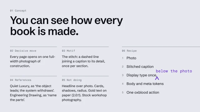
    • See how every book is made.
    • One construction photo, full width, first.
    • Display type once, below the photo.
    • One action, oxblood, at the end.
    • Not: a headline laid over a photo.

    From the skill Write an art-direction brief that survives the build · fictional client

  2. Mark every word nobody could check.

    • Ask of each one: could someone look at the finished page and answer yes or no?
    • “Premium” can’t be checked. “The price is on the first screen” can.
  3. Test it on someone who wasn’t there.

    Give a person, or an AI tool, the instruction and nothing else, and ask for a rough version. If it’s off, fix the instruction, not the sketch.

Nothing you type here is saved or sent.

Briefing an AI for a dashboard

Start with who opens the screen and what they need to know. Savva Sicevs’s prompt asks the AI for exactly that before it draws anything: Prompt Claude for a dashboard that answers.

Example project files
The brief, six parts
1Concept
2One decisive move
3Motif
4References, as principles
5What we're deliberately not doing
6Recipe
What we’re deliberately not doing
1NOT a headline laid over a photo
2NOT cards, shadows or rounded corners
3NOT gold as text on paper (fails contrast)
4NOT stock 'workshop' photography
5NOT scroll reveals; motion only explains a change
6NOT testimonials until we have real ones
How every page is built
1One construction photo, full width, first
2Caption joined to its detail by the stitch
3Display type once, below the photo
4Body at --type-body; materials at --type-meta
5One action, oxblood, at the end

Where the brief lives, shown with a CLAUDE.md file, which one AI builder (Claude Code) reads at the start of every session. Other builders keep standing instructions in their own place; the instruction reads the same.

Where the brief lives
1docs/art-direction.md the brief, all six parts
2
3CLAUDE.md:
4 Read docs/art-direction.md before any UI change.
5 If a change would break a line of it, stop
6 and ask. Never edit the brief to fit the build.

From the skill Write an art-direction brief that survives the build · fictional client

Where yours go: Organize your project, in Prepare.

Full transcript

Most art direction dies quietly in the build. The direction was agreed, the agent started on page one, and by page five it's a pleasant generic website in the right colors. The fix is a brief so precise that drift breaks a sentence.

There are six parts, and each one has to be checkable, by you, by a reviewer, or by the agent itself halfway through page four. A line nobody can check against the build is a mood, and moods don't survive.

The concept is one idea the whole site expresses, in a sentence a stranger could test. Take a fictional bookbinder. 'Timeless craftsmanship' fails, because any page passes it. 'See how every book is made' works. Any section that can't trace back to that sentence gets cut, and that's the first check a reviewer runs. Write the concept first. Everything after it has to serve it.

The decisive move is the single unusually strong decision the rest follow from. For the bookbinder: every page is built around one photograph of construction, full width, before any text. Once that's fixed, the type has to stay quiet, the grid has to leave room, and color can't compete. It rules things out as well: no headline-first pages, no carousel of six products. If your brief has three decisive moves, it has none.

The motif is the visual through-line across every page. Here it's the stitch: a dashed line, drawn the way thread crosses a fold, joining a caption to the detail it names. Once per section, and never as decoration. Write the ration into the brief, or your agent will stitch everything. And test the motif against the concept. A stitch works here because the concept is construction. If your motif could belong to any business in the category, try again.

References go in as principles. 'Make it look like Quiet Luxury' gets you beige and a thin serif. The Quiet Luxury record gives you the principle instead, as its own reading: the object is the protagonist, and the system withdraws so it can be inspected. Write that. Take one principle per reference, because averaging five references gets you their midpoint, which is the generic site again.

The not-doing list is where a brief earns its keep with an AI agent, because it names the defaults before they arrive. Be specific. 'No clichés' can't be checked. 'No headline over a photo' can. Say what moves, too. If motion isn't in the brief, the agent will add it everywhere, so this one allows motion only where it explains a change. One line carries its reason. When the reason is a fact, like a failed contrast check, write it in, so nobody reverses it on taste.

Last, the recipe: the order every page is built in. It's what the agent actually follows on page five, long after the meeting. Five lines, each pointing at something the specification will define as a token.

Then put the brief where the agent will read it: a file in the project, named in your standing instructions, the ones from the lesson on keeping your project in files. Tell the agent to stop and ask if a change would break a line of it. And never let it edit the brief to fit the build, or the brief will end up agreeing with whatever it built.

Then test the brief before anyone builds. Give it to someone who wasn't in the room, or to a fresh AI session, and ask for a rough page three. Wherever their page differs from what you meant, the brief was ambiguous. Fix the sentence that allowed it.

If the build could drift without breaking a line of your brief, the brief isn't finished.
Why an AI builder needs decisions, not adjectives

An AI tool reads “modern” or “premium but approachable” as the most common version of it: a centered headline, a soft gradient, three cards. A line it can check, such as “one photo, full width, first”, is still there in the next session.

Where the order of a page comes from

The pages and the order of sections come from Structure; Design decides how they look. To compare with an order that works, open Layouts: a blueprint for the pages a site needs, and a page layout for the order inside each page.

The AllWeb example

AllWeb’s brief is a real one: the concept, the decisive move (“The module grid is the page grid”), the motif, references as principles, and what it isn’t doing.

Spot the AI-design tells

Go through a generated draft element by element and ask whether a competitor’s AI could have made it by reflex. Grade each one against the brief: a blocker comes out, a possible choice gets confirmed or changed, and every fix is a decision you can say out loud.

What you’ll make

Before you start
The art-direction brief and a generated draft.
You’ll learn
  • A tell is a decision nobody made
  • Grading each one against the brief: blocker, or confirm it was deliberate
  • The costume test: make the styling ordinary and see if the page still works
You’ll make
An AI-tells check: each tell, where it was caught, its reason or none, its grade and its fix.
Worked example
The bakery’s generated draft had a purple gradient, stock croissants, three icon cards and an invented stat bar; all four were blockers, each replaced by a decision from the brief.
Used next
The specification and tokens carry the fixes; the brief review in Test checks for new tells.

AI-tells check

Tell 1
Tell 2
Tell 3
Tell 4

Copy or download your answers before you leave this page.

Nothing is banned: a tell is a choice nobody made. If you can give the reason from the brief, it’s a choice.

Done when every tell on the page has a grade and a fix or a written reason, no blocker is left, and your tells list has a line for each.

More

Example project files
A bookbinder, three tells fixed (fictional)
1TELL hero: headline, paragraph, two buttons
2FIX one sewn spine, full width; one action
3
4TELL icon cards: Handmade · Bespoke · Sustainable
5FIX cut; the photographs already prove it
6
7TELL '500+ books bound'
8FIX removed until the bindery confirms a number

From the skill Spot AI-design tells · fictional client

Where yours go: Organize your project, in Prepare.

Full transcript

You ask for a homepage and get one in under a minute. A big centered headline, two buttons, three cards with icons. It looks fine. The trouble is that nobody chose any of it.

That's what a tell is: a decision nobody made. The test is one question. Could a competitor's AI have made this exact element by reflex? If yes, it's a tell.

Here's a bakery homepage as a generator drafts it, before anyone has written a brief. Start with the surface. A purple-to-pink gradient. Pill buttons with a glow under them. A stock photo of croissants. Then the structure. Everything sits centered on one line, with the same 64 pixels of padding on every section. Three identical cards with icons say fresh, local and artisan. And the headline is filler, crafted with passion, which nobody can check. Last, the stat bar: since 1998, and fifty thousand loaves baked. Ask where those numbers came from. Nobody knows, because the generator made them up.

Nothing on that list is banned. A centered headline can be exactly right. So grade each tell against the brief. The centered layout and the pill buttons might be choices, so they're flagged, and somebody confirms them or changes them. The rest are blockers, and they don't ship. The gradient isn't the bakery's green. The croissants push out the queue photo the brief puts first. And the worst is the stat bar, a false claim with the bakery's name on it.

Then replace each default with a decision from the brief, on the bakery's own colors and type. The queue photo goes first, cropped so no faces show. The real headline sits under it, in Literata. The icon cards become today's bread, which is what people came for. And the invented numbers come off until the owner can source them. None of these fixes is make it prettier. Each one is a decision you can say out loud.

The bookbinder in the worksheet got the same pass: one sewn spine instead of the default hero, the icon cards cut, and the unsourced number removed.

The Quiet Luxury record has a sharper version, the costume test. Make the palette, the type and the spacing ordinary. If the page still says what it should, the design is doing the work. On the bakery, the queue photo and the headline still do.

Tells also land wherever your plan left a gap. 'Hero' is a placeholder the generator fills with its default. 'The morning queue, no faces, headline under it' is a decision. Write that sentence before you prompt.

Keep your own list next to the project: the tell, where you caught it, the fix that worked, and its grade. Your tools have habits. So do you.

If you can't give the reason, the generator chose it.

A tell, or a deliberate choice?

A tell

  • No reason but 'sites do this'
  • Survives any change of brief

A deliberate choice

  • Traces to the brief or concept
  • Used where it earns it
  • Would change if the brief did
The costume test
  • Make the palette ordinary.
  • Make the serif ordinary: a system sans.
  • Halve the whitespace.
  • Does it still communicate luxury?
  • If no, it was relying on the costume.

Turn it into named values

List every color, size and gap as a named value, named after its job and labeled with where it came from. Add a rule for each component with all its states, and say what changes on a phone.

What you’ll make

Before you start
The art-direction brief, type, color, responsive rules.
You’ll learn
Named values by job with sources, component rules with states, responsive rules and checks.
You’ll make
A specification and tokens file.
Worked example
The bakery’s specification: color values were picked from the awning photo and checked as pairs before they went in.
Used next
The builder brief and every Build check.

Specification

Interactions

Every movement on the page has to explain something. Sort each one: signature (one at most), functional or subtle.

Name, by its job 1
Name, by its job 2
Name, by its job 3
Name, by its job 4
Name, by its job 5

Copy or download your answers before you leave this page.

This list and the brief go to your builder before it builds anything.

Done when every value on the pages comes from your list, each has a job and a source, and you’ve written what a script can check and what a person must.

More

Name a value by its job

Named by value: --red, --space-17, --text-xl. Named by job: --action, --space-3, --type-headline. A name by job survives a change of color.

Mechanical:

  • No hex outside tokens.css
  • No font size off the scale
  • No gap off the space scale
  • Every pair passes contrast

Needs a person:

  • Page five still the concept?
  • Is the decisive move intact?
Example project files

Shown as a CSS file of custom properties, one common format. Your builder may keep the same list in another form; the names and values are what matter.

A fictional bookbinder, tokens.css
1:root {
2 /* color, named by job */
3 /* PROVISIONAL: off the awning photo */
4 --action: #1F4D3A;
5 --ground: #FAF6EE; /* my choice */
6 --text: #2A211B; /* my choice */
7 --crust: #8A5A2B; /* my choice */
8 /* the printer's proof, 6 Oct */
9 --accent: #C9A86A;
10 /* type: five sizes by rank */
11 --headline: 3.5rem; /* once a page */
12 --page: 2.25rem;
13 --section: 1.5rem;
14 --read: 1.125rem; /* reading */
15 --small: 0.875rem; /* allergens */
16 /* space: five steps, from --read */
17 --s1: 0.5rem; --s2: 1rem;
18 --s3: 1.5rem; --s4: 2.5rem;
19 --s5: 4rem;
20}
A component rule: the action button
1fill --action; white label, 9.6:1
2hover underline the label
3focus 2px --text ring, clear of fill
4sending label stays; no second tap
5limit one "Order ahead" per page

From the skill Turn the direction into a specification and tokens · fictional client

Where yours go: Organize your project, in Prepare.

Full transcript

Your direction for the bakery says one action, in the awning green. Your agent writes one hex value on the home page, a slightly different one on the next page, and a bluer one in the footer. Each is close. None is the color. A brief describes the direction. A specification turns it into values the build can't approximate.

A specification holds four things. Tokens, the named values for type, color and spacing. Component rules. The responsive rules you wrote at the structure stage. And the checks: how anyone will know the build followed it. Tokens are the part people know about. The checks are what make the rest worth writing.

Here's the start of the bakery's tokens file. Colors named by job, from the color lesson. The five type sizes, from the type lesson. And a spacing scale: five steps, set from the size of the reading text, so every gap on every page comes from one of five values. If a value isn't in this file, it shouldn't be in the build.

Name every token by its job. A token called 'red' breaks the day the brand changes color. 'Space seventeen' tells nobody when to use it. 'Text extra large' invites an extra-extra-large. Named by job, the file reads as a set of decisions, and a wrong use is visible: action on a heading is obviously a mistake.

Then label where each value came from: the brand's own evidence, the brief, the accessibility floor, or your own choice. The green says provisional, because it was read off a photo. The gold names the printer's proof. You're done when every color, size and gap in the file has a name and a source.

The Swiss Style kit has the same habit, with four labels. Required means break it and it isn't Swiss. Period means it was done in period practice, a defensible default. Modern is current good practice and no part of the language. Ours means the kit's authors chose it, so change it freely. Look at the font line: the class of typeface is required, the exact stack is ours.

Component rules use the tokens and cover every state. Here's the bakery's action button: its fill, its label with the ratio, what hover and focus look like, what happens while an order is sending, and how many may appear. That last line comes straight from the direction: one Order ahead button per page. When the agent puts a second one beside the photo, the spec says no.

The responsive rules from your structure work belong in the spec as well, written as rules rather than three layouts. The queue photo stays first at every width, with the headline under it. Nothing hides on a phone without a stated reason. Write the 'never changes' list first. It's the one agents most need.

Then define the checks, in two kinds. Some are mechanical: no raw color value outside the tokens file, no font size off the type scale, no gap off the spacing scale, every pair passing contrast. A script or an agent can run those. Others need a person to look. Tell the agent to score only the mechanical checks and leave the visual ones unjudged rather than guess. Don't add the results into one total, because failing a required rule and departing from your own choice aren't the same result. And end the spec with a short list of rules for the agent, such as never inventing a value the file doesn't hold.

If the build can't be checked against it, it isn't a spec yet.

Where a value came from

Aesthetary’s kits label every value with one of four sources, so you know which ones you can change freely.

Aesthetary’s Swiss Style kit, tokens.css header
1REQUIRED break it and it is not Swiss Style
2PERIOD done in period practice; a default
3MODERN current good practice, not the language
4OURS Aesthetary's own choice; change freely
5
6/* REQUIRED: a neutral grotesque.
7 The stack below is OURS. */
The AllWeb example

AllWeb’s tokens live as CSS custom properties in its stylesheet, from palette v2.0.