Design · Aesthetary Original
Spot AI-design tells
See what makes a page look generated, tell a default from a deliberate choice, and replace the defaults with decisions.
In this skill
A tell is a decision nobody made.
- No reason but 'sites do this'
- Survives any change of brief
- Traces to the brief or concept
- Used where it earns it
- Would change if the brief did
If you can't give the reason, the generator chose it.
2 more scenes are in the video and the transcript.
Transcript
You ask for a homepage and get one in under a minute. A big centered headline, two buttons, three cards with icons. It looks fine. The trouble is that nobody chose any of it.
That's what a tell is: a decision nobody made. The test is one question. Could a competitor's AI have made this exact element by reflex? If yes, it's a tell.
Here's a bakery homepage as a generator drafts it, before anyone has written a brief. Start with the surface. A purple-to-pink gradient. Pill buttons with a glow under them. A stock photo of croissants. Then the structure. Everything sits centered on one line, with the same 64 pixels of padding on every section. Three identical cards with icons say fresh, local and artisan. And the headline is filler, crafted with passion, which nobody can check. Last, the stat bar: since 1998, and fifty thousand loaves baked. Ask where those numbers came from. Nobody knows, because the generator made them up.
Nothing on that list is banned. A centered headline can be exactly right. So grade each tell against the brief. The centered layout and the pill buttons might be choices, so they're flagged, and somebody confirms them or changes them. The rest are blockers, and they don't ship. The gradient isn't the bakery's green. The croissants push out the queue photo the brief puts first. And the worst is the stat bar, a false claim with the bakery's name on it.
Then replace each default with a decision from the brief, on the bakery's own colors and type. The queue photo goes first, cropped so no faces show. The real headline sits under it, in Literata. The icon cards become today's bread, which is what people came for. And the invented numbers come off until the owner can source them. None of these fixes is make it prettier. Each one is a decision you can say out loud.
The bookbinder in the worksheet got the same pass: one sewn spine instead of the default hero, the icon cards cut, and the unsourced number removed.
The Quiet Luxury record has a sharper version, the costume test. Make the palette, the type and the spacing ordinary. If the page still says what it should, the design is doing the work. On the bakery, the queue photo and the headline still do.
Tells also land wherever your plan left a gap. 'Hero' is a placeholder the generator fills with its default. 'The morning queue, no faces, headline under it' is a decision. Write that sentence before you prompt.
Keep your own list next to the project: the tell, where you caught it, the fix that worked, and its grade. Your tools have habits. So do you.
If you can't give the reason, the generator chose it.
Next 5
Everything in Design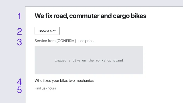 Wireframe for hierarchy before styleSolve a page's structure before any visual style is applied.3 min video
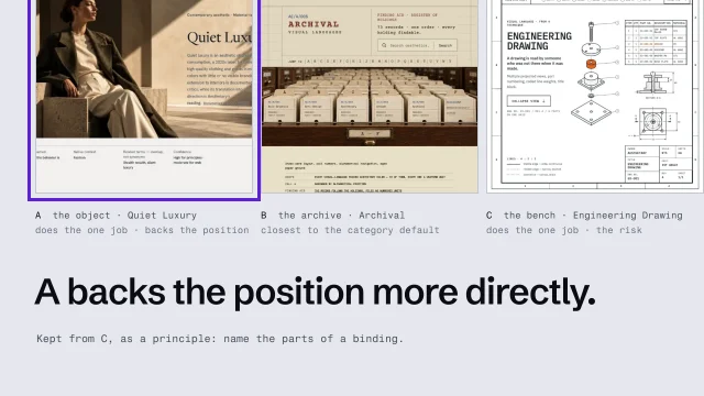 Develop three different directions, then chooseMake three directions that genuinely disagree, and choose between them on evidence.3 min video
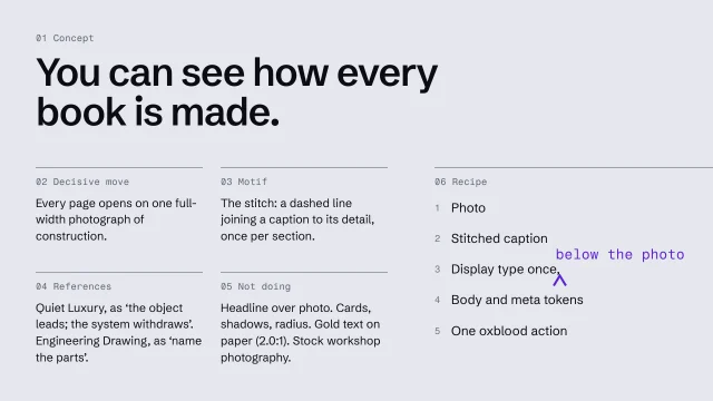 Write an art-direction brief that survives the buildWrite a direction down so precisely the build can't drift from it.4 min video
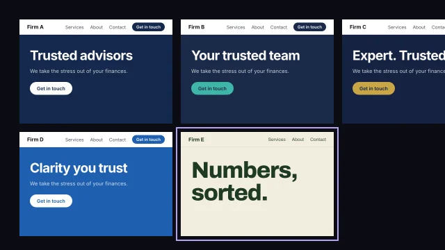 Find your category's defaultSee what every competitor looks and sounds like, so you don't repeat it.3 min video
 Review the work against its briefJudge a build against what it was meant to do, not whether it looks good.4 min video