Design · Aesthetary Original
Choose a typeface and build a type scale
Pick type for a reason you can say out loud, and set a small scale where each size means a rank.
In this skill
A second typeface needs a job the first can't do.
Audition on real copy
- Set the real headline and lines
- Same sizes in every candidate
- Check numerals and italic
- Read it at phone size
- 'Luxury', so a thin serif
- 'Bakery', so a chunky serif
- 'Friendly', so rounded
- What the site must do
- What the copy has to carry
Each size is a rank. If two sizes mean the same thing, delete one.
2 more scenes are in the video and the transcript.
Transcript
Open the styles on a page your AI built and list every font size it uses. If you find nine or ten, ask what the difference between nineteen and twenty pixels is supposed to mean. Nobody will know, because nobody decided.
Choosing a face starts with an audition. Placeholder text hides exactly the problems you're looking for. So set the client's real words instead. Here's the bakery's headline and two real lines, in three candidates at the same sizes. Then look at the parts that break. The numerals, because the bakery shows pickup times. The italic, because sooner or later the site quotes someone. And Young Serif has no italic at all, so the browser fakes one by slanting the letters. And read it at phone size. Plenty of faces that look wonderful at eighty pixels go faint at eighteen.
Then choose against the brief, not against the word. The literal move for a bakery is a warm, chunky serif. Ask what the face has to do instead. People read this site on a phone, in the queue, usually for one thing: what's left, and when it's ready. So the headline face has to hold up at phone size, and its numerals have to be plain.
For the bakery, that face is Literata. It stays clear at phone size, its numerals are plain, and it has a real italic. Everything people read gets a plain sans, down to the prices and allergens. One face for headings, one for reading, and each has a job the other can't do.
Now the scale. Keep it small, and give every step a job. If you can't say what a size ranks, it shouldn't exist. Two sizes that mean the same thing are a bug, and on the page they read as a mistake.
Here's the order page as an agent first built it. It uses ten font sizes. Write the rank each size carries. Where two sizes carry the same rank, merge them. Ten sizes become five: the headline, page headings, section headings, reading text, and small print such as allergens.
Here's the bakery's scale, five steps named by rank, so nobody types text-xl and wonders what it's for. The headline is about three times the reading size, and it appears once per page. When the biggest step is barely bigger than the headings, the page reads like a document.
Size isn't your only tool for rank, and leaning on it alone is how scales bloat. Position, weight and the space around an element all rank things. Swiss Style is the extreme case: hierarchy comes from position on the grid.
Then put the five into the tokens file, and tell your agent that any other size is a bug to report, never a value to invent.
Each size is a rank. If two sizes mean the same thing, delete one.
Next 4
Everything in Design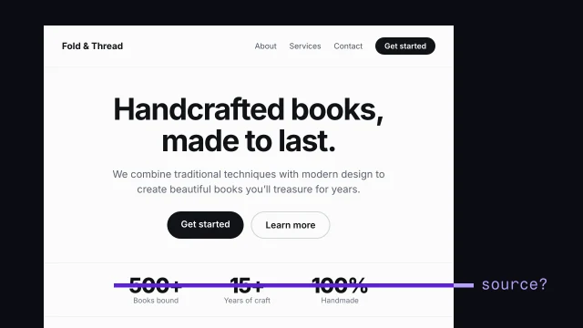 Spot AI-design tellsSee what makes a page look generated, and fix it.3 min video
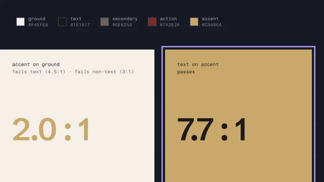 Build color roles and check contrastGive each color a job from the brand's real colors, and make sure text can be read.4 min video
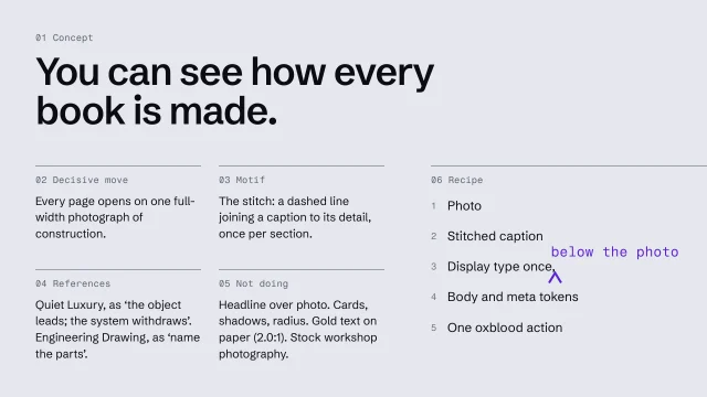 Write an art-direction brief that survives the buildWrite a direction down so precisely the build can't drift from it.4 min video
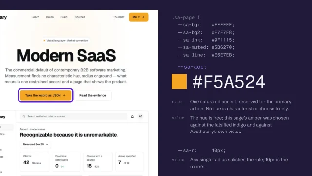 Turn the direction into a specification and tokensExpress a direction as a specification and named tokens a builder can check against.4 min video