Design · Aesthetary Original
Develop three different directions, then choose
Make three directions that genuinely disagree, and choose between them on the brief rather than on taste.
In this skill
Three directions, and they have to disagree.
- Same layout, new palette
- Differ only on the surface
- A different decisive move
- A different motif
- Each wins for its own reason
If swapping the colors makes two directions the same, you have one direction.
4 more scenes are in the video and the transcript.
Transcript
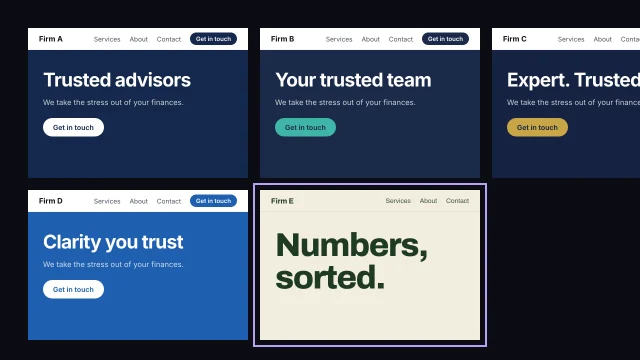
Ask an AI tool for three design directions and you'll often get one direction in three colorways. Same layout, same type, a navy one, a green one and a terracotta one. You can't choose between those on evidence, because they don't disagree about anything.
So why three directions? One direction gets approved by default. Two becomes a coin toss. Three gives the client a real comparison, and gives you room for one that's a risk. But the number only works if they disagree about something that matters: the one decisive move each direction commits to.
Here's the swap test. Take the palette from one and put it on another. If they now look like the same site, they were the same direction.
Here are three for the bakery. A, Morning queue: documentary photos in warm early light, and confident type. B, Flour and paper: craft paper and hand-drawn labels. C, the neighborhood notice board: type only, like the board in the window. Now put A's colors on all three. They stay three different sites, so these are three directions.
Then the order. Write your three directions before you open the records. Name the visual language each one leans on and what you expect its rules to be. Only then open the records. The gap between your prediction and the record is the useful part. If you look first, you'll never find out what you'd have assumed. Keep the predictions in the same file as the directions.
Develop all three to the same depth. One sentence naming the decisive move. The top of the home page. One inner page, because many directions look great as a hero and fall apart on a page of prices. And the type, with one real image from the client. If you finish your favorite and sketch the other two, the client will pick the finished one.
Choose against three things, and taste isn't one of them. The site's one job, from the brief. The position the business can back with evidence. And the category default: if every bakery site you found already looks like B, B has to work much harder. Score each direction in writing before anyone says which one they like.
Here's what that looks like for the bakery. All three can do the site's one job, getting regulars to order ahead. A backs the position best: bread, baked every morning, is on every screen. B sits right on the category default. The notice board lost the bread entirely. The decision is written down with its reason.
Then the part people skip. Don't blend the winner with the best bits of the losers. That averages three ideas back into the middle you were trying to leave. Keep one principle at most, written as a principle. From C: today's bread as a plain list, like the menu board. And keep the other two directions in the project folder, so when someone asks about them later, you can show why they lost.
If swapping the colors makes two directions the same, you have one direction.
Next 5
Everything in Design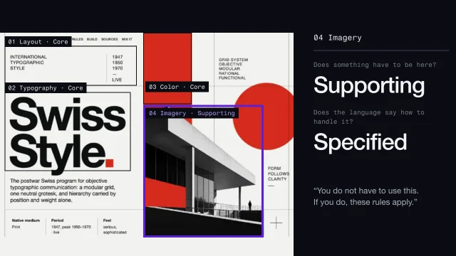 Read a visual language area by areaDescribe any look in the same twelve areas, so nothing is skipped or assumed.4 min video
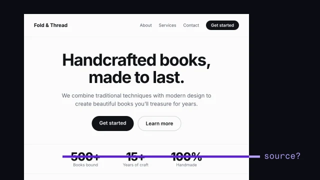 Spot AI-design tellsSee what makes a page look generated, and fix it.3 min video
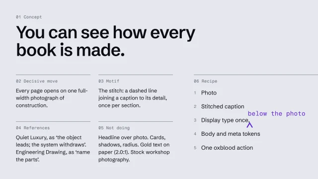 Write an art-direction brief that survives the buildWrite a direction down so precisely the build can't drift from it.4 min video
 Find your category's defaultSee what every competitor looks and sounds like, so you don't repeat it.3 min video
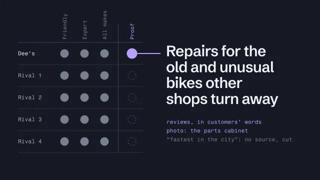 Position with proofChoose a position the business can back with evidence.3 min video