Design · Dashboards That Work, part 2 of 2
Prompt Claude for a dashboard that answers
By Savva Sicevs, Contributor
Tell the AI the answer and the reader, use Savva's prompt, and check the result in five seconds.
Silent for now, so the captions are on. Savva’s own narration is coming.
From Savva’s article How to get Claude to design a good dashboard (Prompt + Skill), 7 October 2026. Aesthetary made the video and the fictional Wickerloaf examples with Savva’s permission.
In this skill
Tell the AI who opens the screen, what they need and who they are. Then check in five seconds that they get it.
Transcript
Dashboards That Work, part two: how to get Claude to design a good dashboard.
In part one, Savva named four tells: no answer at the top, everything equally loud, a screen that's never calm, and a zero that lies. They all come from one thing. The AI doesn't know what the screen is for, or who will read it, so it guesses. You have to tell it two things: the answer, and the reader.
Start with one sentence: who opens the screen, what they want to know, and what they do next. Savva's own example is a shop owner checking today's sales and the orders to ship. That sentence decides what goes at the top, and the AI can't guess it for you. For the bakery, the owner opens it to find out whether any of this morning's orders can't be filled, and then she calls those customers.
Then say who's reading. Give the same screen to someone who has lived in it for years, and to someone who opens it once a week, and one of them gets it in a second while the other stares at it. Savva cites a NASA study from nineteen eighty-six. Researchers regrouped dense Space Shuttle displays into cleaner ones. People without expertise got much faster and more accurate. Experts made fewer errors, but weren't any faster, because they already knew where to look. Stephen Few puts it simply: where the lines are drawn depends entirely on the audience.
For a reader who's new to it, the answer has to be impossible to miss. Make it the biggest thing, put it where the eye lands first, and give it the color. For the bakery owner, that's the two orders that need a call. The supporting numbers stay: orders ahead today, and the change on last Tuesday. They get smaller type, and gray, where the answer gets color.
For an expert, you can turn it down. Wickerloaf's head baker reads this every morning to plan the next bake, so the head baker's version is denser. Every loaf, what was ordered and baked, what's left, and the change on last week, with quieter accents. Right for the person who reads it daily, and hard for anyone else.
Two states need rules of their own. When nothing needs attention, the screen says so, and stays mostly empty. And when the data doesn't load, it never shows zero. It shows that it failed, and how old the last update is.
Detail goes somewhere it can wait: a tooltip, a side panel, or a second page. Tap the seeded rye, and a panel opens with the history behind the answer.
Here's Savva's prompt. You paste it before you ask for the screen, and fill in the brackets. First it asks Claude to write one line and show it to you: who opens this screen, to find out what, and what they do next. Then it names the reader: new to this, or an expert who uses it every day. Then seven rules. The answer goes at the top as a condition, and it's the biggest thing on the screen. Color only for the answer, and for up or down. One block stands out. When nothing needs attention, say so. Never show zero for data that didn't load. Detail goes in tooltips, panels or a second page. And a new reader gets one answer, a few numbers and one chart, while an expert gets more, with quieter accents. The full prompt, ready to copy, is in Savva's article. The link is with this lesson.
If you'd rather not paste it every time, put the rules in a Claude skill, which Claude uses automatically when it's relevant. Savva publishes his own, the Style kit, as a Claude plugin.
Then check it in five seconds. Show the screen to someone close to the real user, for five seconds, and ask what they saw. If they say the answer, two orders need a call, it works. If they name the loudest thing on the screen, and it isn't the answer, the accent is in the wrong place. And if only someone who already knows the bakery gets it right, you've built an expert screen. That's fine, as long as experts are who will use it.
Your exercise. Write the answer sentence and the reader for a dashboard you need. Run Savva's prompt, copied from his article. Show the result to one person for five seconds, and write down what they said. You're done when you have the sentence, the screenshot and their answer, plus one change if they named the wrong thing.
This lesson was adapted from How to get Claude to design a good dashboard, by Savva Sicevs. The bakery examples were added by Aesthetary. Part one, why AI dashboards look like slop, is on his site too.
Next 3
Everything in Design Why AI dashboards look like slopSpot the four structural tells that make a polished AI dashboard useless, and fix the first: put the answer at the top.By Savva Sicevs, Contributor6 min video
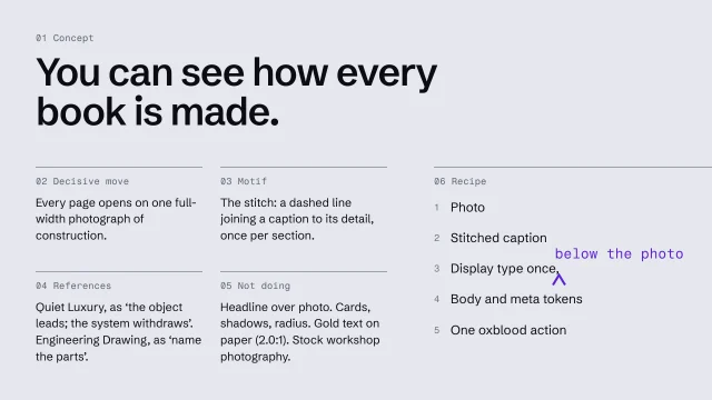 Write an art-direction brief that survives the buildWrite a direction down so precisely the build can't drift from it.4 min video
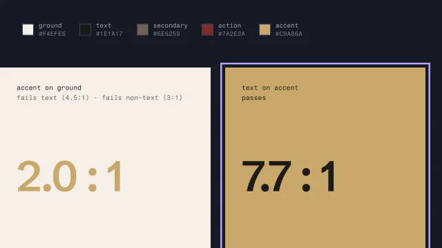 Build color roles and check contrastGive each color a job from the brand's real colors, and make sure text can be read.4 min video