Design · Aesthetary Original
Build color roles and check contrast
Turn a brand's real colors into roles with one job each, and make sure every text and background pair can be read.
In this skill
Gold on the order page, before and after
From evidence to roles
- Start from colors with a source
- Give each one a single job
- Name the token after the job
When the brand color fails, change its job before you change the color.
4 more scenes are in the video and the transcript.
The mechanics, from the source
These come from the organizations that make the tools. They teach how the tool works; the skill above is about when and why to use it.
Official resource · W3C WAIStandard · Documentation
Understanding Contrast (Minimum)Docs · 18 min read
The WCAG contrast rule (4.5:1, or 3:1 for large text) and why it exists.
Official resource · WebAIMOfficial tool · Tool
WebAIM Contrast CheckerTool · Tool
Enter two colors and see whether the pair passes for text and interface parts.
Transcript
The bakery's gold is on every paper bag the shop hands over. Put it on the page as link text, on cream, and it fails contrast badly. Now you have to tell the owner, and you need a better answer than 'we can't use your color'.
Start from colors that have a source: the logo file, the site's own styles, a printed brand guide. For the bakery, the gold comes from the printer's proof for the artwork on its paper bags. A color read off a photo doesn't count, because the light and the camera changed it. The awning green was read off a photo, so it stays marked provisional until the sign-maker sends the reference. Then give each color one job: ground, text, action, headings. One color doing two jobs means the visitor can't tell a button from a decoration. Name the token after the job, so action rather than green, because the job is what the rest of the build depends on.
Here's the bakery's set. The green takes the action role: links and buttons. Crust brown is for section headings. The gold is the problem. Everyone wants it to do something important, and nobody has checked whether it can.
The minimums come from the W3C, and their explanation is worth reading in full. In short: normal text needs a contrast ratio of 4.5 to 1 against its background. Large text needs 3 to 1, and large means roughly 24 pixels, or about 19 bold. The edges of controls, focus indicators and meaningful icons need 3 to 1 as well. That last one is the rule people miss. These are minimums, and the stricter AAA level asks for 7 to 1 on normal text.
So check every pair the page will actually use, in both directions. Text on the ground: fourteen point six to one. The green: nearly nine. Crust brown, for headings: five point four. White on the green button: nine point six. All pass. Gold on the cream ground comes out at about two to one. That fails as text, and it fails as an input border. White on a gold button fails too. Now the last two. Dark text on a gold field passes comfortably, and gold text on a dark ground passes as well.
Here's what two to one looks like on the order page. Gold link text. A gold border on the name field. Gold words on the few-left badges. Hard to read in good light. On a phone in the morning sun, close to invisible. So change its job. The links go green, with an underline. The name field gets a crust-brown border. The few-left badges become a gold field with dark text. And the footer turns dark, with the gold as its text. Every one of those pairs passes.
That's the move when a brand color fails. Change its job before you change the color. Gold can't carry links on cream. It can be the field behind dark text, and it can be the text color in the page's one dark section. If you truly need a gold link on cream, darken it until it passes and record it as a derived color, labeled as yours, so nobody later thinks it came from the proof.
And here's the better answer for the owner. Your gold stays. It changes job. It sits behind dark text on the few-left badges, and it's the text color in the dark footer. As link text on cream it measures two to one, well under half the minimum, and the numbers for every pair are attached. A color that moves jobs is a much easier conversation than a color that disappears.
One more rule from the same guidance: don't use color as the only way to convey something. Take the color away and look. Without an underline, a green link in a paragraph is just more text. Add the underline, and it still reads as a link, color or not.
Then write the ratio next to the token, so the next person, or your agent, can see which pairs were checked, and against what. The gold's line now says its job, and the only places it may appear.
When the brand color fails, change its job before you change the color.
Next 4
Everything in Design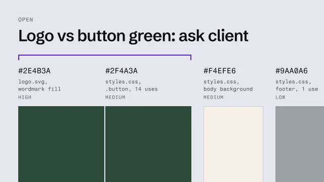 Take brand colors from evidenceFind a brand's real colors from its code and its logo, never from a photo.4 min video
 Choose a typeface and build a type scalePick type for a reason and set a scale where each size means a rank.3 min video
 Turn the direction into a specification and tokensExpress a direction as a specification and named tokens a builder can check against.4 min video
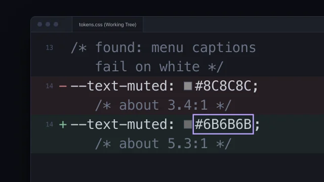 Fix accessibility at the sourceFix an accessibility failure where it starts, not with a patch on top.5 min video