Structure · Aesthetary Original
Wireframe for hierarchy before style
You'll be able to settle a page's structure in grayscale, so you know what it says and in what order before any style touches it.
In this skill
Solve what the page says, and in what order, while it's gray.
- Choosing the typeface first
- Lorem ipsum in every box
- Stock photos as placeholders
- Building it in the real site
- Grayscale, the system font
- Real copy from the manuscript
- Boxes labeled with the image
- A separate sketch area
Decide what the eye hits first and what it reads next while the page is still gray.
2 more scenes are in the video and the transcript.
Transcript
Ask an AI agent for a homepage and you get a styled one: a color, a font, a gradient, a stock photo. Then the review turns into an argument about the gradient, and nobody notices the prices are buried at the bottom.
So solve the structure first, on purpose, before any style exists. Here's the same homepage in gray, with the bakery's real copy. Style gets in the way of these decisions. A gray page keeps everyone looking at the order.
Keep it deliberately unresolved. Grayscale, the system font, no brand color, and boxes labeled with what each image will show. The copy, though, is real, because hierarchy depends on what the words say and how long they are. Lorem ipsum hides both. Sketch on paper, draw boxes, or have an agent build a rough structural page, as long as it lives somewhere separate from the production site.
Now number everything in the order you want it read. Number one is the dominant element. For the bakery, that's the photo of the morning queue, then the headline under it, then the button, then today's bread, then the visit details.
Then test it. Step back from the screen, or blur it, and see what your eye lands on first, then second. Here's a draft where the bread list is set big and dark. Blur it, and the list lands first. The numbers didn't hold. Make the list quieter and squint again. The photo wins, then the headline. Better still, show it to someone for five seconds and ask what the page is about.
If you'd rather have an agent build the rough page, tell it what to leave unresolved, as plainly as this. Without those lines it will reach for a color and a typeface, because that's what a finished-looking page has. Pointing it at the manuscript keeps the real copy in. Pointing it at a separate folder keeps the sketch out of the site, so nobody can mistake it for the start of the build.
Reading order isn't only visual. A screen reader follows the order the page is written in the code, and WCAG asks that the reading sequence can be worked out correctly wherever order affects meaning. So the code says the same order, and at phone width the slots stack in that order too. Decide it here and the build can follow it.
The wireframe's done when each page type has one dominant element, every slot from the content model is placed and numbered, the copy is real, and someone who isn't you reads it in the order you meant. Then style has something to serve.
Decide what the eye hits first and what it reads next while the page is still gray. Style comes after, and it has to keep that order.
Next 4
Everything in Structure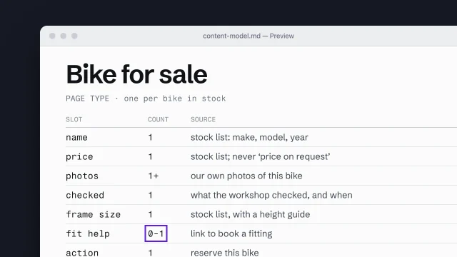 Build a content model from page types and slotsDescribe each page type as the content slots it must hold.4 min video
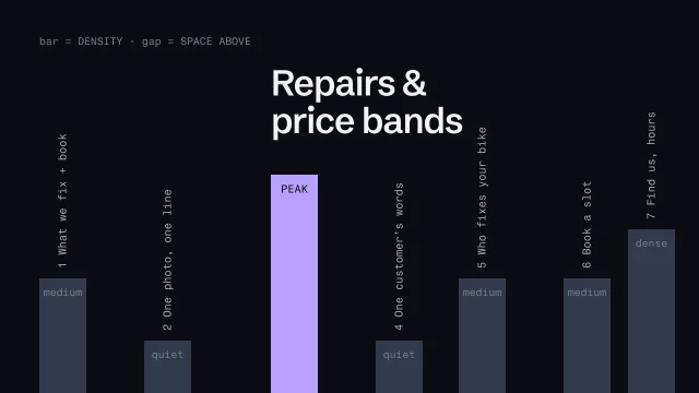 Plan section rhythm across a pageVary density and rest down a page so it builds instead of repeating.3 min video
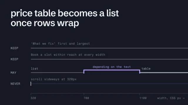 Plan responsive structure as rulesWrite the rules a layout follows as the width changes.3 min video
 Spot AI-design tellsSee what makes a page look generated, and fix it.3 min video