Research · Aesthetary Original
Find your category's default
You'll be able to see what every competitor in a category looks and sounds like, so you can choose on purpose whether to match it.
In this skill
Ask an AI chat for a homepage. Compare it with your grid.
Build the grid
- Pick six to ten real alternatives
- Capture each homepage at one width
- Note headline, palette, imagery
- Put them all on one page
Find the default first. Then keep it or break it on purpose.
1 more scene is in the video and the transcript.
Transcript
Every category of business has a look and a way of talking. Put ten of its websites side by side and they blur: the same smiling person, the same three columns, the same adjectives. Nobody chose it. It's also what an AI tends to reach for when you name the category. Find it on purpose, or you'll design it by accident.
Build a competitor grid. Pick six to ten businesses a customer would actually compare: the ones that come up when they search, and the ones your client mentions. Capture each homepage at the same width. For each, note the headline, the adjectives, the palette, the kind of imagery, and what the main button says. Then put them all on one page. One site at a time always looks reasonable. Side by side, the pattern shows. Keep the grid in your project files as private research. Don't publish it about other businesses.
A few more columns find the quieter default. The main button: 'Get in touch' everywhere is a default too. What a phone shows before any scrolling. The proof they lean on: reviews, client logos, badges from professional bodies. And price: shown, hidden, or 'from'. These are the places where a site can be more useful than its competitors, which matters more than looking different.
Here's a shortened grid for five fictional accounting firms in one town. Read down the columns. 'Trusted' in four headlines out of five. Three use navy, a fourth uses blue. Two handshakes and a skyline. That's the default, visual and verbal. Firm E is the one you'd remember, and prettiness has nothing to do with it. It says something plainly and shows a real person.
Write the default in a few plain lines. For the bakeries nearby: celebration cakes up front, stock photos of croissants, the menu as a PDF, no way to order ahead. Once it's written down you'll see it everywhere, including in your own first draft. If it takes more than five lines, you're describing individual sites instead of the pattern.
Now a quick test. Open any AI chat and ask for a homepage headline and hero image for a neighborhood bakery, with nothing else. Put its answer next to your grid. If it lands on the same words and pictures, you've found the default from two directions, and you know what an agent will build if your brief doesn't say otherwise.
Some of the default is convention, and conventions exist because they help people. An emergency plumber's phone number at the top. Prices where visitors look for them. A clear booking button. Keep those, because breaking them makes the site harder to use. The cliché is the part that carries no information: the handshake, 'trusted', navy because it's finance. Question each of them. When you can't tell which is which, ask what a visitor would lose if it disappeared. If the answer is nothing, it's cliché.
The reason to move away should come from your research: the customers' own words, a claim the business can prove, a fact about how it works. If the bakery's reviews keep saying 'the sourdough sells out by ten', that's your reason. Write the default and your reason side by side in the project file, and take both into the positioning.
Find the default first. Then keep it or break it on purpose.
Next 5
Everything in Research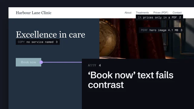 Audit an existing siteLook at a current site several ways and decide what matters most.4 min video
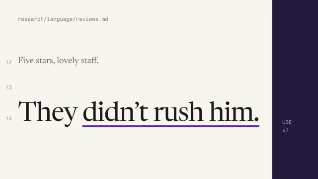 Mine customer language from reviewsFind the words customers actually use, and keep them.3 min video
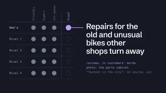 Position with proofChoose a position the business can back with evidence.3 min video
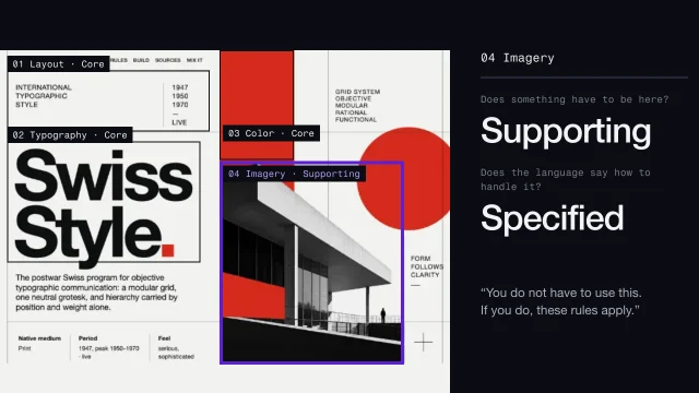 Read a visual language area by areaDescribe any look in the same twelve areas, so nothing is skipped or assumed.4 min video
 Spot AI-design tellsSee what makes a page look generated, and fix it.3 min video