Structure · Aesthetary Original
Plan section rhythm across a page
You'll be able to plan the run of a page's sections so it builds to a point and gives the reader somewhere to rest.
In this skill
A page is a sequence. Plan it like one.
- Same padding on every section
- Three cards, three times over
- Every section: heading, grid
- Two dense sections in a row
- Gaps from the spacing scale
- One layout per job
- A quiet band after a dense one
- One peak, then the action
Plan where the page rests and peaks, or it repeats the same section until it runs out.
1 more scene is in the video and the transcript.
Transcript
Scroll a lot of AI-built pages and you'll see the same thing. Headline and three cards. Headline and three cards. Every section weighs the same, so the page never builds to anything. It just stops.
Rhythm is how sections sit in a row. Some are dense, like a list or a form. Some are quiet: one photo, one line, space. Dense all the way down is exhausting. You want a sequence that rises to one point, gives people room, and ends somewhere useful.
Mark each section on your wireframe: its job, its density, whether it's the peak, and the space above it. More space before a section says something new starts.
Here's the bakery's sheet. It peaks at the top, on the queue photo and the headline. Then it rests on one line about ordering and the button, one rem under the headline, because they finish its thought. The practical details sit at the bottom, dense, for people who scroll down for them.
Here's that homepage the way an agent first lays it out. Every band is a heading, a line and three cards, with the same two rem above each, a gap that isn't even on the spacing scale. Draw how much happens in each band as a bar beside it. The bars come out the same length. Equal bars mean there's no rhythm yet, and the page reads as long. Now the bakery's real homepage, built from the plan. One peak: the queue photo and the headline. Then a quiet band, one line and the order button. Today's bread at medium. And Visit at the bottom, dense and small.
The gaps come from the spacing scale: half, one, one and a half, two and a half, and four rem. Two and a half rem above Today's bread and above Visit says something new starts. One rem and one and a half sit inside a band, where things belong together, like the headline and its order line. And four rem, the biggest step, closes the page above the footer. Side by side, the flat page is a list people skim, and the planned one has a shape. The quiet band got quiet by taking things out of it, not by adding space.
Then keep the sheet, because the build will flatten it: agents give every section the same padding by default. Scroll the build beside the sheet, and fix a busy band in the spacing system, not with one nudged margin.
Plan where the page rests and peaks, or it repeats the same section until it runs out.
Next 4
Everything in Structure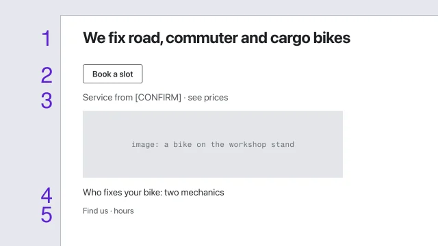 Wireframe for hierarchy before styleSolve a page's structure before any visual style is applied.3 min video
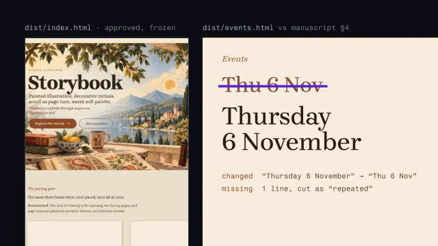 Assemble the site without losing the contentBuild the whole site from an approved homepage without drifting from the manuscript.4 min video
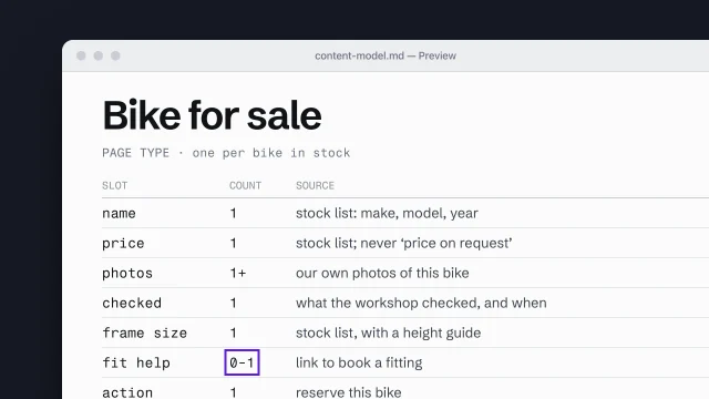 Build a content model from page types and slotsDescribe each page type as the content slots it must hold.4 min video
 Turn the direction into a specification and tokensExpress a direction as a specification and named tokens a builder can check against.4 min video