Structure · Aesthetary Original
Plan responsive structure as rules
You'll be able to write the rules a page's layout follows as the screen narrows, so the build doesn't have to guess.
In this skill
Write the rules a layout follows, then check them with pictures.
- At 768px, switch layouts
- Hide the sidebar on mobile
- Mobile gets a shorter page
- Stack when columns get narrow
- Sidebar below what it supports
- Same content at every width
Write what must survive and what may move. The widths will take care of themselves.
1 more scene is in the video and the transcript.
The mechanics, from the source
These come from the organizations that make the tools. They teach how the tool works; the skill above is about when and why to use it.
Official resource · web.dev (Google)Official documentation · Course
Learn Responsive DesignCourse · 16 modules
Media queries, layouts, responsive images and type, from the Chrome team.
Transcript
Most responsive plans are three pictures: desktop, tablet, mobile. The site looks right at those three widths and breaks at three hundred and sixty-two pixels, where nobody looked.
Screens come in every width, and people resize and zoom. Three layouts can't cover that. Rules can. Write them per page type, before the build, in plain sentences.
Keep rules say what survives at every width: the main element, the reading order, the main action, and no sideways scrolling, which WCAG's Reflow criterion asks for at 320 CSS pixels. May rules say what can give way, and when.
Here are two rules for the bakery's Today's bread page. The first: the menu sits beside the shop's name while it fits, and goes under it when it doesn't. The second: a loaf's price sits beside its name while both fit, and otherwise drops under it. Now narrow the window. At six hundred and twenty-five pixels the menu drops under the shop's name. That isn't a tablet width. It's where the name and the four links stop fitting on one line. Keep going, down to three-twenty. Every price still fits beside its loaf, so the second rule never acts, and nothing scrolls sideways. The content decides when a rule acts, not a phone size. Now the owner renames Country loaf to Country loaf, the sourdough, in the list the pages are built from, and you drag again. At four hundred and thirty pixels its price drops under the name, while the others stay beside theirs. The rule didn't change. The width took care of itself.
Be careful with hiding. If a slot is in the content model, someone needs it, and people on phones are often the ones in a hurry. And reorder in the source, not only visually, so a screen reader gets the same page as everyone else.
Write each rule so an agent could follow it without asking: the element, what changes, the trigger, and what stays the same, like the two you just watched. 'Make it work on mobile' gets you the agent's default: stack everything and quietly hide what doesn't fit.
Put the rules in the agent's spec. Then sweep every width, the way you just watched, find the exact point where something breaks, and fix the rule, not the one width.
How rules become CSS is taught well, and free, in the course named on screen. What no course can decide is what your page must keep. That's your call, in writing, before anyone opens the code.
Write what must survive and what may move. The widths will take care of themselves.
Next 4
Everything in Structure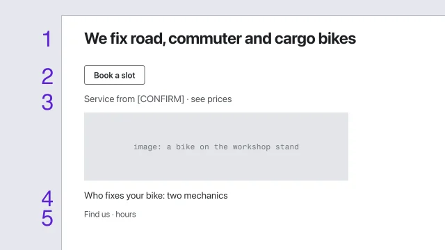 Wireframe for hierarchy before styleSolve a page's structure before any visual style is applied.3 min video
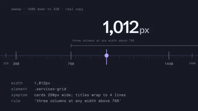 Test responsive behavior across every widthFind the exact width where a layout breaks.3 min video
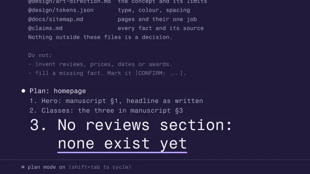 Brief an AI agent before it writes codeGive an agent everything it needs, and nothing it can misread, before it builds.4 min video
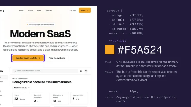 Turn the direction into a specification and tokensExpress a direction as a specification and named tokens a builder can check against.4 min video