Plan · Aesthetary Original
Write a one-page website brief
You'll be able to write a one-page brief that says what a site must do before anyone designs it.
In this skill
A brief says what the site must do, before how it looks.
- Make it look modern
- Social feed on the homepage
- A gallery of every frame
- More commissions start online
- Price range known up front
- Fewer calls about hours
Write what has to change, and how you'll know, before anyone decides how it looks.
1 more scene is in the video and the transcript.
Transcript
Most site projects go wrong before the first sketch. The client describes a feeling, the designer hears a feature list, and nobody writes down what the site is for. A one-page brief fixes that. It's the first thing I write after the interviews.
A brief names what has to change for this business once the site exists. It doesn't pick colors or fonts or a template. If you catch yourself writing about how the site looks, you've jumped ahead, and later you'll be defending a style nobody agreed to.
Take a fictional framing workshop. Ines runs it on her own. She asked for a modern look, her social feed on the homepage, and a gallery of every frame she's ever made. Those are wishes: none of them says what should happen. Underneath, she loses evenings answering calls about opening hours, people walk out when they hear the price, and she wants commissions to start online so she can quote from a photo. Each of those is a change you could check. My test: three months after launch, could I tell whether it happened? If yes, it's a goal. If not, it's a wish, and it waits until a goal asks for it.
Before the full brief, write one sentence: the site's one job. For Ines it's this. Get people with something to frame to send a photo and a size, so she can quote before they visit. One line forces a choice. If you need two sentences, you've got two sites, and one of them will lose.
Then the page itself, in five parts. Purpose is the one job and why it matters now. Sources lists what the brief rests on: the interview notes, the inventory of what's already online, anything the client sent you. Do-not is what the site must never do. Outcomes are the goals, written so you could check them. And the last part says who signs the site off, and against what. Keep it to one page. If it runs longer, you've started designing inside the brief.
Here's hers, a line per part. Look at the do-not list, because that's where a brief earns its keep. No testimonials until Ines gives us real ones. No same-day turnaround, because some jobs take her a week. No stock photos of frames she didn't make. An AI will write every one of those if you don't forbid it. Ask for a framing site and it reaches for 'trusted by hundreds of happy customers', because that's what framing sites say. The do-not block stops it before it starts.
You can use AI here, after you've written your own draft. Ask it to tag each line goal or wish, and say how you'd check each goal after launch. It's good at catching a feeling dressed up as an outcome, and it wasn't in the room, so you make every call.
The part people skip is how the site will be judged. Write the checks now, while nobody's attached to a design, and write each one so a stranger could run it and get the same answer. Does the first screen make the one job obvious? Can someone send a photo and a size from their phone in under a minute? Did Ines supply every claim on the page? Here's a check like that being run, on the bakery's site from this course. Is ordering ahead on the first screen of a phone? At three-seventy-five wide, it's there in the header, so anyone who looks gets the same answer: yes. At the end you review the build against these lines, and so does Ines. That's what a brief is for. It can say no.
Write down what has to change, and how you'll know it did, before anyone opens a design tool.
Next 4
Everything in Plan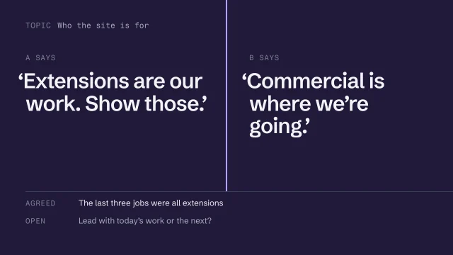 Interview stakeholders who disagreeInterview two people who want different things and record the disagreement.4 min video
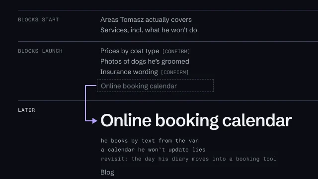 Turn wishes into requirementsSort what was asked for into what blocks the start, what blocks launch, and what waits.3 min video
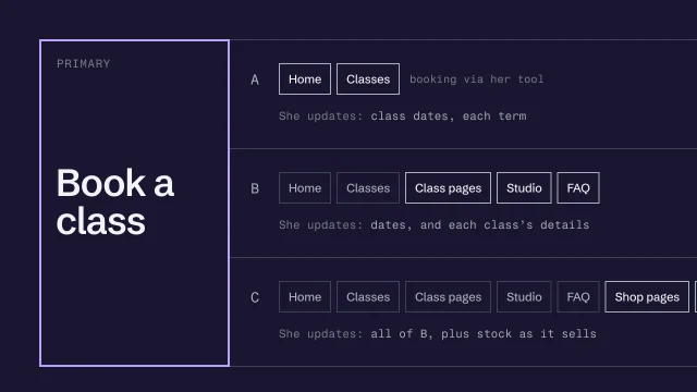 Decide what the site is for, and how much to buildName the site's one action and offer scopes the client can choose between.4 min video
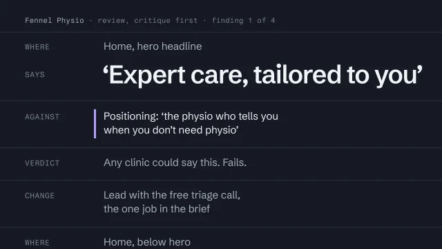 Review the work against its briefJudge a build against what it was meant to do, not whether it looks good.4 min video