Design · Aesthetary Original
Prepare images for the web
You'll be able to turn a graded photo into files sized for each width, placed so nothing jumps, with alt text for its place.
In this skill
One photo in, a file per width
- One line per photo
- Export each width it needs
- WebP, one quality
- Run it on a copy
Export a file for each width, give it a shape, and write alt text for its place.
Transcript
This photo of the venue, for my speculative AllWeb redesign, is three and a half megabytes and three thousand pixels wide. On a phone, the page shows it about three hundred and thirty pixels wide. A photo that's graded and approved still isn't ready for a page. It needs a file for each width it's shown at.
The redesign makes all its image files with one script. Each photo gets one line: its source, its treatment, and the widths it's needed at. The venue is black and white, at two widths: a large file and a small one. For each width, the script resizes the graded photo and saves it as WebP, a modern format current browsers all read. One quality setting covers the whole set. Run it on a copy of the site, and every image comes out the same way: all seventy-nine, in about half a minute. The venue's small file is thirty-eight kilobytes, and the large one a hundred and forty.
Then the line that puts it on the page. The source set lists both files and their widths. Sizes tells the browser how wide the picture will be shown: the full width on a phone, forty percent on a wide screen. The browser does the arithmetic and picks a file. Width and height give the page the photo's shape before the file arrives, so nothing below it jumps. And because the venue is far down the page, it loads lazily, only when you scroll near it. The photos on the first screen leave that out, because they're needed straight away. Check it in a browser. At phone width, nothing from the venue loads with the page. Scrolled to it, a phone screen at normal density gets the six hundred file, and a sharp screen gets the twelve hundred. Last, the alt text. Write what the picture shows in its place on the page, for someone who can't see it: the mosque in daylight, its minarets and domes above the entrance plaza. Not image of venue, and never the file name.
Put it all in the asset list, one block per image: the slot, the files and their sizes, the shape, how it loads, the alt text and the credit. Anyone can then check the page against it.
Export a file for each width, give it a shape, and write alt text for its place.
Next 3
Everything in Design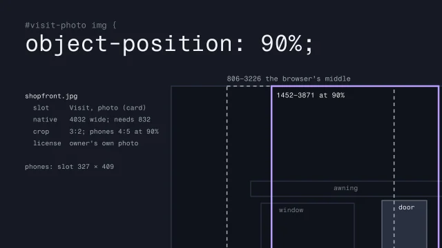 Is this image fit for its slot?Check each photo against the place it goes: its width, its grade, its crop at every width and its rights.3 min video
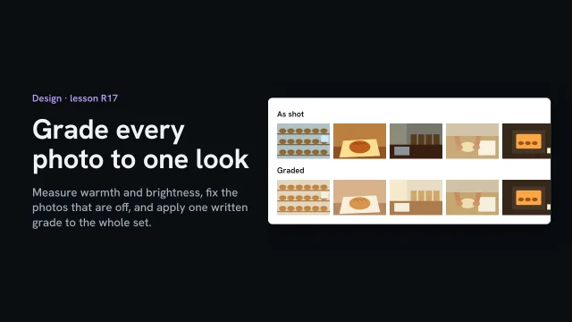 Grade every photo to one lookMeasure warmth and brightness, fix the photos that are off, and apply one written grade to the whole set.2 min video
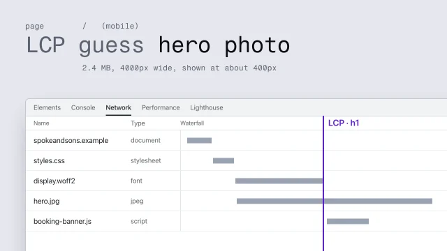 Predict, measure and fix performanceFind what makes a page slow and fix it at its origin.4 min video