Typography
Typefaces, how they pair, how type is scaled, and type used as image.
2 to open·
Typefaces
44 families
The families Aesthetary chose to build each Aesthetic page. Each Aesthetic’s own rules say what its type has to do; none of its records names one of these faces.
Display
Big headlines and short lines, built to be seen before they’re read.
Big Shoulders Display
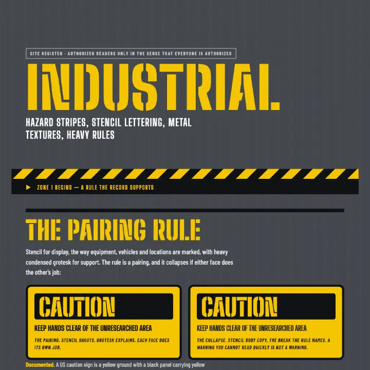
Hazard stripes, stencil lettering, metal textures, heavy rules
A headline in Big Shoulders Display
Big Shoulders Stencil Display
Hazard stripes, stencil lettering, metal textures, heavy rules
A headline in Big Shoulders Stencil Display
Playfair Display
Clashing pattern on pattern, layered elements, full-bleed color, no empty space
A headline in Playfair Display
Text
Paragraphs and long reading, built to disappear into the words.
Bricolage Grotesque
Fashion presented as story, atmosphere and attitude — where photography, styling, typography and composition become a single art-directed experience.
A short paragraph, set in Bricolage Grotesque at reading size, to see how its lowercase holds a line.
Cormorant Garamond
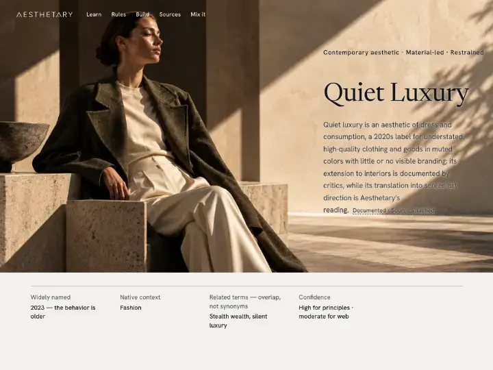
An aesthetic of understated quality: value communicated through material, proportion, craftsmanship, fit, detail and restraint rather than conspicuous branding or decorative display.
A short paragraph, set in Cormorant Garamond at reading size, to see how its lowercase holds a line.
Familjen Grotesk
Pale neutrals, daylight photography, rounded corners, functional clarity
A short paragraph, set in Familjen Grotesk at reading size, to see how its lowercase holds a line.
Hanken Grotesk
An aesthetic of understated quality: value communicated through material, proportion, craftsmanship, fit, detail and restraint rather than conspicuous branding or decorative display.
A short paragraph, set in Hanken Grotesk at reading size, to see how its lowercase holds a line.
IBM Plex Sans
Multiple projected views, part numbering, coded line weights, title block
A short paragraph, set in IBM Plex Sans at reading size, to see how its lowercase holds a line.
Josefin Sans
Textured illustration, bright flat color, organic shapes, confident negative space
A short paragraph, set in Josefin Sans at reading size, to see how its lowercase holds a line.
Source Serif 4
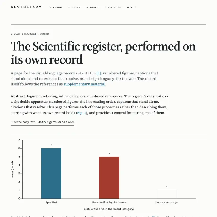
Figure numbering, inline data plots, numbered references
A short paragraph, set in Source Serif 4 at reading size, to see how its lowercase holds a line.
Space Grotesk
Clashing pattern on pattern, layered elements, full-bleed color, no empty space
A short paragraph, set in Space Grotesk at reading size, to see how its lowercase holds a line.
Work Sans
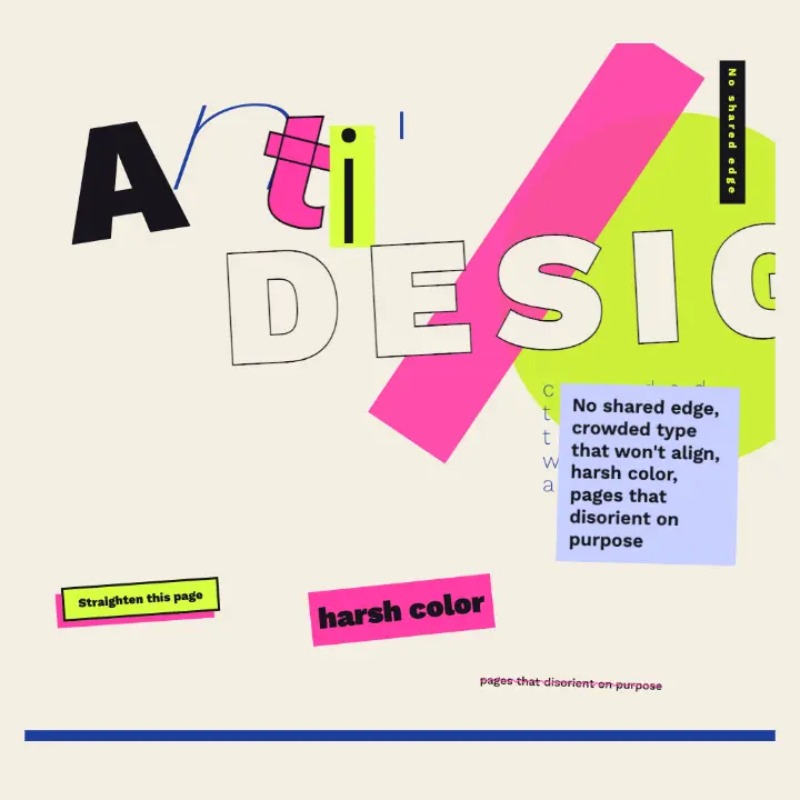
No shared edge, crowded type that won't align, harsh color, pages that disorient on purpose
A short paragraph, set in Work Sans at reading size, to see how its lowercase holds a line.
Zilla Slab
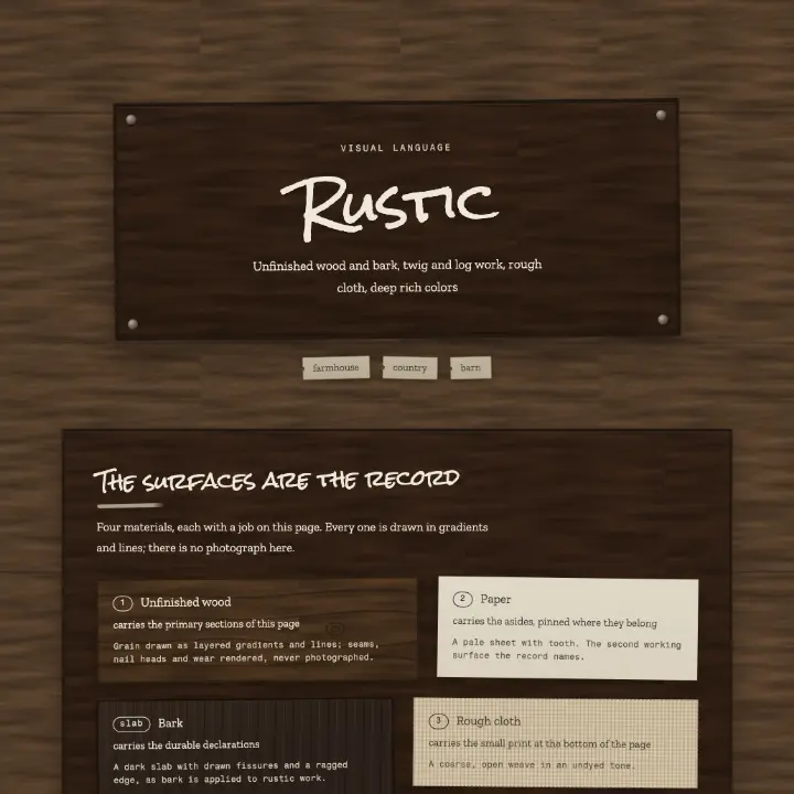
Unfinished wood and bark, twig and log work, rough cloth, deep rich colors
A short paragraph, set in Zilla Slab at reading size, to see how its lowercase holds a line.
Mono
Every character the same width — for code and tabular data.
Courier Prime
Fashion presented as story, atmosphere and attitude — where photography, styling, typography and composition become a single art-directed experience.
const face = "Courier Prime";
DM Mono
Fashion presented as story, atmosphere and attitude — where photography, styling, typography and composition become a single art-directed experience.
const face = "DM Mono";
Geist Mono
The commercial default of contemporary B2B software marketing. Measurement finds no characteristic hue, radius or ground — what recurs is one restrained accent and a page that shows the product.
const face = "Geist Mono";
IBM Plex Mono
Multiple projected views, part numbering, coded line weights, title block
const face = "IBM Plex Mono";
Space Mono
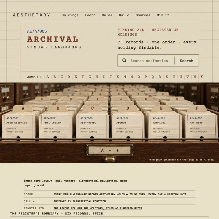
Index-card layout, call numbers, alphabetical navigation, aged paper ground
const face = "Space Mono";
Other
Neither the family’s own name nor its font file declares a use, so it isn’t guessed at here.
Abril Fatface
Clashing pattern on pattern, layered elements, full-bleed color, no empty space
Archivo
Squiggles, speckle and animal-skin laminates, unrelated shapes, loud color paired against expectation
Archivo Black
Squiggles, speckle and animal-skin laminates, unrelated shapes, loud color paired against expectation
Archivo Narrow
Ben-Day dots, thick black outlines, primary colors, speech-bubble devices
Bangers
Ben-Day dots, thick black outlines, primary colors, speech-bubble devices
Barlow Condensed
Hazard stripes, stencil lettering, metal textures, heavy rules
Bodoni Moda
Fashion presented as story, atmosphere and attitude — where photography, styling, typography and composition become a single art-directed experience.
Brygada 1918
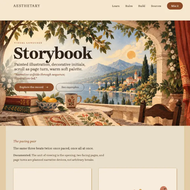
Painted illustration, decorative initials, scroll as page turn, warm soft palette
Caveat
Starburst motifs, boomerang shapes, upswept roofs, neon signs
Frank Ruhl Libre
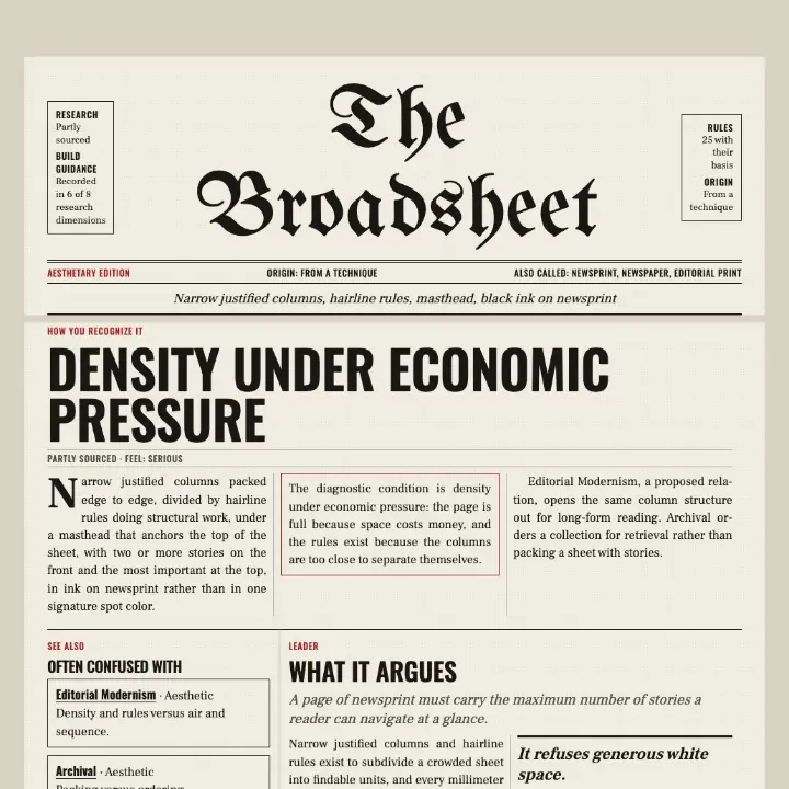
Narrow justified columns, hairline rules, masthead, black ink on newsprint
Gabarito
Starburst motifs, boomerang shapes, upswept roofs, neon signs
Geist
The commercial default of contemporary B2B software marketing. Measurement finds no characteristic hue, radius or ground — what recurs is one restrained accent and a page that shows the product.
Karla
Contour lines, legend panel, grid coordinates, route markers
Literata
Spread composed as one image, bled photography, one restricted typeface, generous white space
Newsreader
Fashion presented as story, atmosphere and attitude — where photography, styling, typography and composition become a single art-directed experience.
Nunito
Translucent colored plastic, blob forms, chrome and gloss, chunky rounded type
Oswald
Spread composed as one image, bled photography, one restricted typeface, generous white space
Permanent Marker
Sticker layers, washi tape, handwriting, rotated elements
Petrona
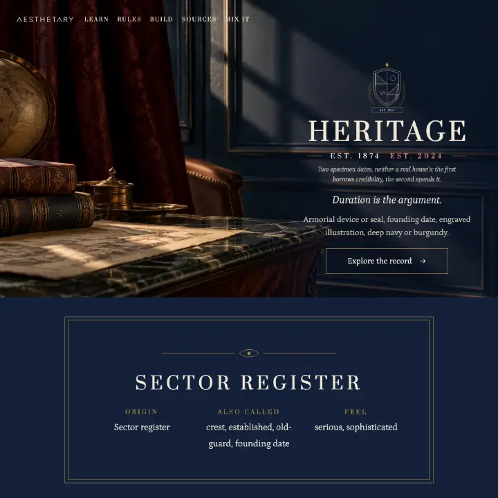
Armorial device or seal, founding date, engraved illustration, deep navy or burgundy
Prata
Armorial device or seal, founding date, engraved illustration, deep navy or burgundy
Rock Salt
Unfinished wood and bark, twig and log work, rough cloth, deep rich colors
Shippori Mincho
Emptiness around a single subject, a withheld message, space left for the viewer to fill
Spectral
Contour lines, legend panel, grid coordinates, route markers
UnifrakturMaguntia
Narrow justified columns, hairline rules, masthead, black ink on newsprint
Yellowtail
Textured illustration, bright flat color, organic shapes, confident negative space
Zen Kaku Gothic New
Emptiness around a single subject, a withheld message, space left for the viewer to fill
Font pairings
20 Aesthetic pages set in two families
Two families used together on one Aesthetic page: its name in one, its line in the other. No record says which face displays and which reads, so no role is claimed.
Type scales & hierarchy
28 Aesthetics
How big each level is, from each Aesthetic’s design grammar. The sizes are Aesthetary’s reading, set here in the house face; the rules beside them are the ones the record cites.
Japanese Minimalism
Cited in the record
- Say less: the ads are meant to raise questions, not spell out the philosophy.
- Keep the setting deliberately ordinary.
- Heading1.375rem · 400 · line height 1.4 · tracking 0.08em
- Body0.9375rem · 400 · line height 1.9
- Label0.75rem · 500 · line height 1.7 · uppercase · tracking 0.22em
- Displayclamp(2.5rem, 7vw, 5rem) · 400 · line height 1 · uppercase
- Heading1.5rem · 400 · line height 1.15
- Text1.125rem · 400 · line height 1.55
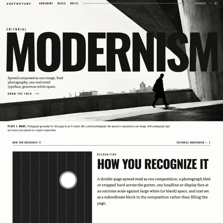
Editorial Modernism
Cited in the record
- Restrict the type: Brodovitch set Harper's Bazaar in a single Didone family throughout.
- Blow a single-word headline up across the double spread.
- Headlineclamp(3rem, 12vw, 10rem) · 700 · line height 0.9 · uppercase · tracking -0.01em
- Deck1.5rem · 300 · line height 1.75rem
- Text1.0625rem · 400 · line height 1.75rem
- Caption0.8125rem · 400 · line height 1.75rem · tracking 0.04em
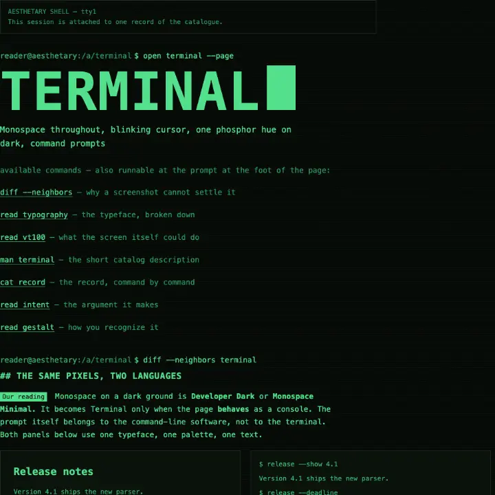
Terminal
Cited in the record
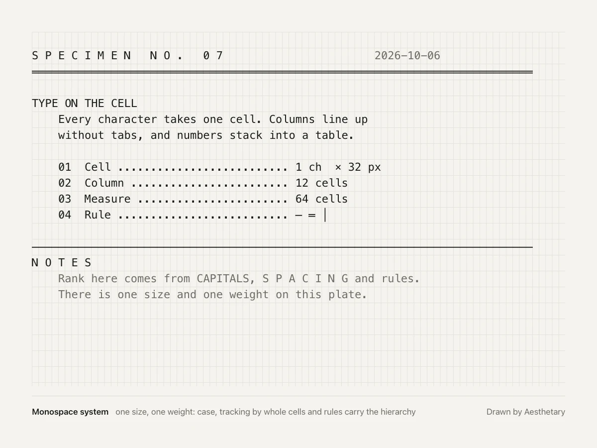
- Set monospace for everything, headings and navigation included.
- Put every glyph in a fixed cell: the same advance, the same line pitch.
- Rank with rendition attributes: bold (or brightness), underline, blink, reverse video.
- Set a whole line double-width for a title; it holds half the characters.
- Line1rem · 400 · line height 1.6
- Double1rem, scaled 2 x wide · 400 · line height 1.6
- Displayclamp(2.75rem, 7vw, 4.75rem) · 600 · line height 1.02 · tracking -0.03em
- Heading2rem · 600 · line height 1.15 · tracking -0.02em
- Body1.0625rem · 400 · line height 1.6
Maximalism
The record cites no typography rule of its own
- Displayclamp(2.5rem, 7vw, 5.5rem) · 400 · line height 0.95
- Text1.125rem · 500 · line height 1.55
- Label0.8125rem · 700 · line height 1.3 · uppercase · tracking 0.08em
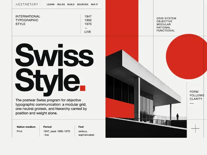
Swiss Style
Cited in the record
- font-family: the grotesque stack above. Any face in the class satisfies it.
- text-align: left everywhere; never justify.
- Rank headings by position and space above, taking any size change from the few type sizes.
- Never rank by size alone or color alone.
- Use only the three roles in the table across the whole site.
- Every line-height and vertical margin is a multiple of 0.75rem, half the module.
- max-width: 66ch on running text.
- Headline1.625rem · 700 · line height 2.25rem
- Body1.0625rem · 400 · line height 1.5rem
- Label0.75rem · 700 · line height 1.125rem
Y2K
Cited in the record
- Set display type rounded, bloated or chunky.
- Use a soft-cornered, rounded grotesk, tight, with gloss on display.
- Displayclamp(4rem, 14vw, 9rem) · 900 · line height 0.9 · tracking -0.04em
- Heading2.375rem · 900 · line height 1.1 · tracking -0.02em
- Body1.0625rem · 500 · line height 1.6
Cartographic
Cited in the record
- Set type to a standard so sizes and styles stay the same from sheet to sheet, and place every label for legibility.
- Tie each label unambiguously to what it names; never let two labels collide.
- Let case carry meaning where it is declared: on NOAA charts capitals mark an accurately positioned landmark, mixed case an approximate one.
- Let slope carry units where it is declared: upright numerals for fathoms and feet, sloping for meters.
- Label index contours with their elevation.
- Titleclamp(2rem, 4.4vw, 3.5rem) · 400 · line height 1 · tracking 0.32em
- Headingclamp(1.5rem, 3vw, 2.125rem) · 600 · line height 1.15
- Body1.0625rem · 400 · line height 1.6
- Label0.75rem · 500 · line height 1.3 · tracking 0.06em
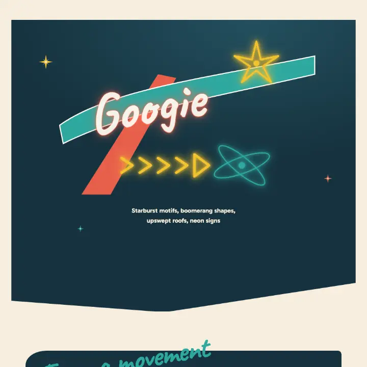
Googie
Cited in the record
- Script, in a signage role, at an oblique angle.
- At Johnie's the name ran in large free-form script across the roof edge, outlined in neon set in channel letters.
- Neon made flowing cursive script signage especially popular.
- Scriptclamp(48px, 7vw, 84px) · 700 · line height 1
- Statementclamp(26px, 3.6vw, 42px) · 900 · line height 1.1
- Body18px · 400 · line height 1.6
- Label13px · 800 · line height 1.4 · uppercase · tracking 0.08em
Scientific
Cited in the record
- Letter figures clearly and consistently, large enough to stay legible when the figure is reduced.
- Keep figure lettering live and editable, not outlined.
- Titleclamp(1.5rem, 3.4vw, 2.1rem) · 600 · line height 1.25
- Body1rem · 400 · line height 1.72
- Caption0.8rem · 400 · line height 1.6
- Figure10.5px at column width · 600 · line height 1
Pop Art
Cited in the record
- Carry comic lettering into the image: the sound word is part of the picture, not a label on it.
- Display5rem · 400 · line height 0.95 · uppercase · tracking 0.02em
- Balloon1.5rem · 400 · line height 1.12 · uppercase · tracking 0.04em
- Body1.125rem · 400 · line height 1.5
- Caption0.8125rem · 700 · line height 1.3 · uppercase · tracking 0.06em
Archival
Cited in the record
- Set labels in typewriter monospace.
- Keep letters upright, a uniform black line without shading or hairlines.
- No ornament or flourish on any letter.
- Treat typewriting as one stage, not the defining technique: cards were handwritten, then typed, then printed, so an upright unornamented hand or print face is as true to the catalog.
- Label0.75rem · 400 · line height 1.5 · uppercase · tracking 0.1em
- Heading0.9rem · 700 · line height 1.35 · uppercase · tracking 0.12em
- Entry0.9rem · 400 · line height 1.7
Neo-Brutalism
Cited in the record
- Oversized sans-serif headlines with abrupt scale shifts.
- Quirky or slightly eccentric typefaces, balanced by generous whitespace.
- Monospace may appear as a nostalgic early-interface reference.
- Display6rem · 400 · line height 0.92 · tracking -0.02em
- Heading2.5rem · 400 · line height 1.05
- Body1.125rem · 500 · line height 1.55
- Label0.8125rem · 700 · line height 1.4 · uppercase · tracking 0.06em
Heritage
Cited in the record
- Set display in traditional serif capitals.
- Do not use a contemporary sans.
- Displayclamp(2.25rem, 7vw, 5.5rem) · 400 · line height 1.05 · uppercase · tracking 0.14em
- Text1.1875rem · 300 · line height 1.75
Engineering Drawing
Cited in the record
- Letter in a plain sans formed by single strokes; titles in capitals, lower case rare on the drawing itself.
- Set lettering vertical or inclined at 75 degrees, and never mix the two in one title.
- Titleclamp(2.375rem, 4.4vw, 4.25rem) · 300 · line height 1
- Headingclamp(1.375rem, 2.6vw, 1.875rem) · 500 · line height 1.2
- Body1rem · 400 · line height 1.6
- Label0.75rem · 500 · line height 1.4 · uppercase
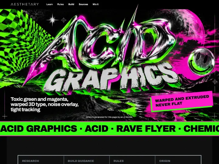
Acid Graphics
Cited in the record
- Warp the display type and extrude it in 3D; both, together.
- Render type as viscous, dripping liquid metal.
- Interrupt the type and set contrasting fonts side by side.
- Displayclamp(3rem, 12vw, 9rem) · 400 · line height 0.8 · upper · tracking -0.09em
- Headingclamp(1.75rem, 3vw, 2.375rem) · 400 · line height 0.9 · upper · tracking -0.07em
- Body1.0625rem · 400 · line height 1.55 · tracking -0.01em
Mid-Century Modern
Cited in the record
- A humanist or geometric sans with warmth, plus period script for accent.
- Type was eclectic: European sans serifs alongside recut gothics and slab serifs, occasionally a formal script.
- Covers used abstracted iconography with simple typography and lettering.
- Displayclamp(46px, 7vw, 92px) · 700 · line height 0.95 · tracking -0.01em
- Headingclamp(34px, 5vw, 56px) · 700 · line height 1.05
- Body19px · 400 · line height 1.65
- Label13px · 700 · line height 1.4 · uppercase · tracking 0.24em
- Script0.72em of the name · 400 · line height 1
Industrial
Cited in the record
- Pair two faces and never collapse to one: stencil for display, heavy condensed grotesk for support.
- Never set body copy in stencil.
- Keep the stencil's bridges: they exist to hold the cut template's interior islands in place.
- Keep stencil as a typeface and stencil as a process apart: a stencil font on screen borrows the look of the process, so do not claim it as the process.
- Displayclamp(2.5rem, 7vw, 4.5rem) · 900 · line height 0.9 · uppercase · tracking 0.02em
- Support1.25rem · 800 · line height 1.2 · uppercase
- Text1.1875rem · 500 · line height 1.5
New Wave Typography
Cited in the record
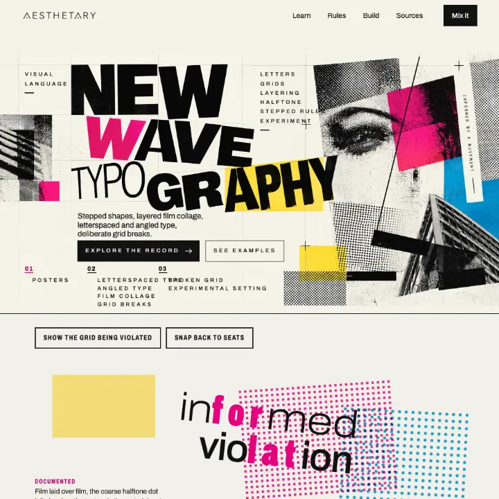
- Change weight inside single words and let letterspacing be inconsistent.
- Set type out of line and at non-right angles.
- Display5.5rem · 900 · line height 0.86 · upper · tracking 0.3em on one run, -0.03em elsewhere
- Heading1.75rem · 900 · line height 1.1 · upper · tracking 0.24em
- Body1.0625rem · 400 · line height 1.55
Broadsheet
Cited in the record
- Serif for the text, condensed sans for the furniture, tightened.
- A newspaper text face may be condensed with short descenders, to allow tight linespacing.
- Set nothing below 8pt.
- Headclamp(1.5rem, 2.6vw, 2.25rem) · 600 · line height 1.02 · uppercase
- Kicker0.75rem · 500 · line height 1.2 · uppercase · tracking 0.06em
- Text1rem · 400 · line height 1.45
- Displayclamp(3rem, 9vw, 8rem) · 900 · line height 0.82 · tracking -0.05em
- Thininherit · 100 · line height inherit
- Text1.0625rem · 400 · line height 1.5
- Titleclamp(2.4rem, 4.2vw, 3.5rem) · 400 · line height 1.05
- Initial3.6rem · 700 · line height 0.9
- Passage1.16rem · 400 · line height 1.7
- Heading1.1rem · 400 · line height 1.35
- Display4.4rem · 400 · line height 1.35
- Heading1.9rem · 400 · line height 1.4
- Body1.05rem · 400 · line height 1.7
- Label0.78rem · 400 · line height 1.6
Scrapbook
Cited in the record
- Use handwriting.
- Mix handwritten entries with printed matter in the same volume.
- Label0.95rem to 1.4rem · 400 · line height 1.25
- Text0.95rem · 400 · line height 1.6
- Tag0.7rem · 400 · line height 1.4 · tracking 0.04em
Fashion Editorial
Cited in the record
- When type is present, art-direct its relationship to the image: frame, contrast, identify the story, pace, interrupt, behave as image, or all but disappear.
- Rank by scale alone: one element enormous, everything else small, no mid-tier.
- Displayclamp(3rem, 12vw, 9rem) · 700 · line height 0.9
- Text1.0625rem · 400 · line height 1.5
- Meta0.6875rem · 400 · line height 1.4
Quiet Luxury
Cited in the record
- The one branding source asks for high-quality fonts and names no serif or sans class.
- Displayclamp(2.5rem, 6vw, 4rem) · 400 · line height 1.05
- Body1.0625rem · 400 · line height 1.6
- Label0.8125rem · 500 · line height 1.45
Expressive typography
Type that carries the image: movement, lettering, distortion.
1 more in Cultural Review, not shown here until the hold clears. How cultural review works
1 more record has no description yet, so it isn’t listed here.
Typography techniques
How type is set and produced.
Where type leads
15 Aesthetics