Color & Palettes / Element
Pastel palette
A palette built from tints — hues carrying enough white to read as soft and high in lightness while keeping their hue identity.A live demonstration by Aesthetary, built from the recorded description. A specimen, not evidence.Where the text contrast comes from
Forbidden by the record: “relying on a pastel for text contrast”. Lilac on butter measures 1.21:1. WCAG asks for 4.5:1 for body text.
“Text contrast must come from a dark ink or a saturated accent outside the pastel set.” Ink on butter measures 13.85:1.
Contrast ratios are computed at build time with the WCAG 2 relative-luminance formula, from the hex values shown.
Color & Palettes·
What stays put, what can change
Stays put from the record
- Text contrast source: ink or accent outside the pastel set
- Lightness: high or more
- Never: relying on a pastel for text contrast
- Never: treating a neutral off-white as a pastel
- Never: treating a grayed mid-tone as a pastel
Free to change what the record leaves open
- Which hues, and how many (the record’s typical range is 3 to 6)
- Which ink or accent carries the text
- Whether one tint leads, so long as none dominates by lightness
Where it appears
-
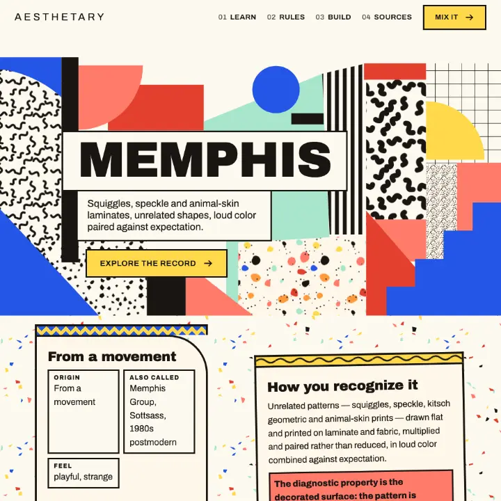 Memphis
Its record binds this Element but none of its rules mention it by name.
-
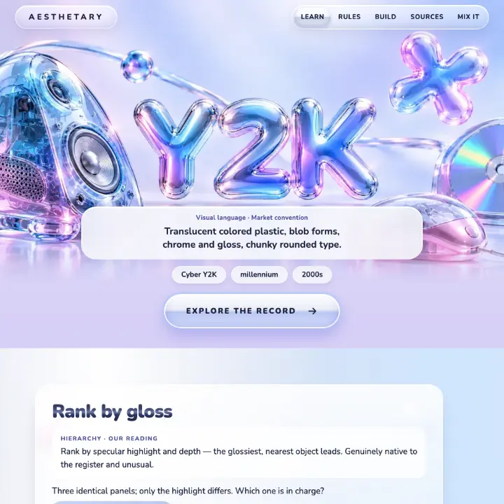 Y2K
Colour: pastel metallic.
color · historical practice · SUPPORTED
The pictures show each whole Aesthetic, not this Element on its own. The rules are that Aesthetic’s, quoted from its record.
Also bound in 4 records outside the public collection.
Read the full definition
Adopting this means every hue in the palette is a tint: a recognizable hue mixed with enough white that its lightness is high and its perceived intensity is low, without losing which hue it is. Several tints sit together without one dominating, because near-equal lightness removes the usual contrast hierarchy — so hierarchy must be carried by something else, and text contrast must come from a dark ink or a saturated accent outside the pastel set rather than from within it. Two boundaries matter: a pastel keeps its hue, so a near-achromatic off-white is not one; and a pastel is light, so a grayed mid-tone is a muted color, not a pastel.
Evidence and provenance
- Record
pastel-palette· Color- Definition
- Full record: summary, definition, properties and constraints.
- Specimen
- Drawn by Aesthetary from the recorded description. Specimens may demonstrate a claim and never evidence one.
- Cultural review
- No cultural flag on this Element or its source.